Drupal services we deliver
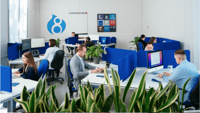
Lemberg Solutions is a Drupal development company that provides a full suite of Drupal services to clients all around the globe. Check out our services below:

Custom development
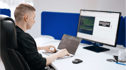
Create a unique Drupal platform using our custom Drupal development services. Our Drupal development agency provides development of platforms of any complexity, including Drupal CMS development services or implementation of any functionalities for your existing Drupal website.

Drupal integrations
Streamline data exchange and communication among all tools and solutions your business already uses by integrating your Drupal platform with third-party tools and services.

Drupal personalization
Personalize your Drupal platform and gain an edge over the competition by providing a unique user experience to your clients. We'll ensure your platform delivers relevant content to website users based on their interests.
OUR CLIENTS

Henkel


Greenpeace


Astronics
Client experience
I am extremely pleased with our collaboration with Lemberg Solutions (LS). They integrated seamlessly into our processes, and both my team and I have learned a great deal from them. I highly value LS's expertise and flexibility.

OUR SERVICES & COOPERATION MODELS





partnerships
Why clients choose us
15+ years of experience with complex Drupal projects
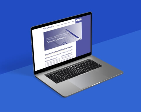
Our expert Drupal developers have completed large-scale Drupal projects with advanced functionality. Among these was a project for a Norwegian bookstore comprised of 15 million SKUs. We also have been cooperating with Centarro for more than four years now. Centarro is the company behind Drupal Commerce, and our Drupal development experts contribute to this platform’s development alongside its creators.
Award-winning Drupal agency
Lemberg Solutions Drupal agency has been delivering Drupal projects for 15+ years and has since gained a number of Drupal awards and partnerships. Among these are the Silver Upsun (formerly Platform.sh) partnership, Drupal Association supporting collaboration, and Acquia bronze level partnership. Our Drupal web development company also received several Drupal awards, including "Splash Awards Website of the Year" and "Splash Awards Winner."
ISO security and quality management standards
Our Drupal company provides high-quality and secure Drupal development services confirmed by ISO 9001:2015 and ISO 27001:2013 certifications. ISO 9001:2015 and ISO 27001:2013 certifications prove that we deliver top-quality services compliant with security protocols ensuring your data safety. Besides, Lemberg Solutions offers high management standards, top-level quality control, and data security.
Active involvement in the Drupal ecosystem
Our Drupal web experts combine working on projects with contributing their code to the community of Drupal web developers. The 881 Drupal.org contributions of our team include such modules as Menu items extras, Range, Commerce Tax Conditions, Bokbasen checkout, CKEditor5 Line Height. Being a Drupal CMS development company, Lemberg Solutions is a regular exhibitor and sponsor of DrupalCon events, which unite Drupal development agencies and enthusiasts worldwide.
Contact us
Get in touch with Roman to discuss your Drupal platform and learn how you can benefit from cooperating with Lemberg Solutions.

Roman oversees the development, testing, and implementation of all Drupal-based projects at Lemberg Solutions, supervising the process at every stage.
