4 Oct 2023 – Read our review of five examples of embedded systems we built for our clients from consumer electronics, agritech, automotive, healthcare, and industrial domains.
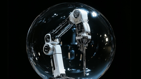
Edge AI vs Cloud AI Architecture: How Not to Drain Your AI Investments?
24 Mar 2026
You are a business that wants to develop an embedded AI solution. Suppose you need a sound recognition application with a 10K device fleet. Continuous sound streaming generates about 200TB of data per
Agentic AI vs. Generative AI: Key Considerations in Building an Autonomous Workforce
18 Mar 2026
AI, like ChatGPT, has gone from a premium to a mainstream productivity tool across enterprises and industries. Tasks that once required significant time, expertise, or human resources can now be
We are thrilled to announce becoming a Partner with NXP Semiconductors Inc., advancing our efforts in delivering high-quality embedded software and hardware. NXP is a major manufacturer of high
How to Develop HIL Testing Infrastructure for Industrial Embedded Systems — Expert Insights
10 Feb 2026
HIL testing tutorial: learn why HIL testing has become a strategic asset for industrial enterprises and figure out the nuances of designing a custom HIL setup.