UI/UX App Design
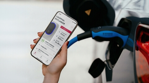
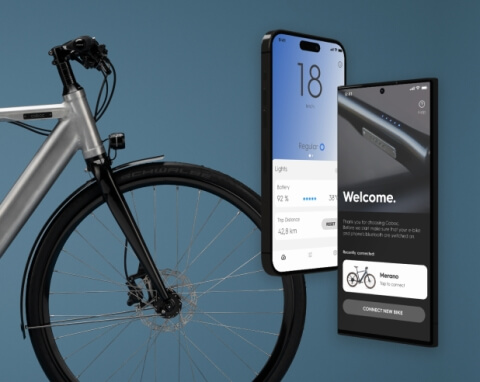
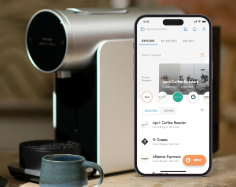
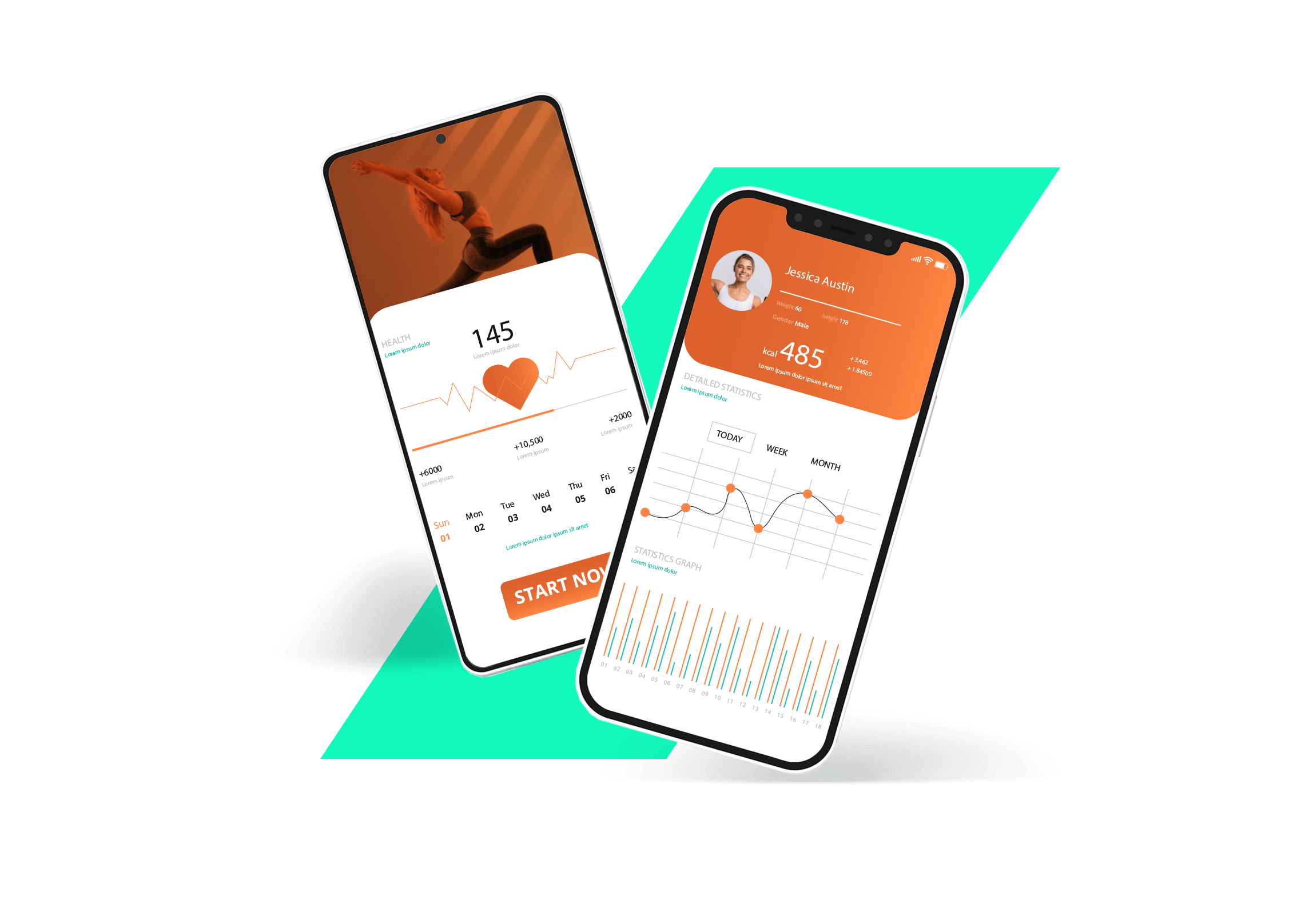
Enable your customers to solve their problems intuitively with a mobile app that features native UI components and an iOS or Android user experience. Apart from native UI/UX, Lemberg Solutions can design the look of cross-platform applications. Our mobile app development company will put your audience’s needs at the forefront to craft an interface that drives user engagement, following the Material Design 3 best practices.
Tech stack
iOS app development
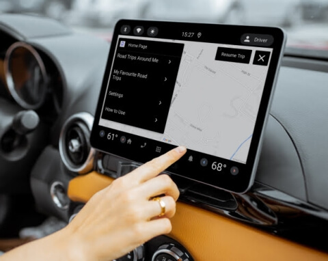
Engage your audience through a robust native iOS application with our mobile application design and development team. Our apps provide exceptional user experience and run smoothly on iOS devices, leveraging device-specific features like camera, Face ID, BLE, and Wi-Fi. We follow App Store Guidelines and best security practices to ensure your app will go live without any issues. You can request custom iOS mobile app design and development services or get engineering help with your existing app. Besides iOS apps for mobile, our team creates apps for iPad devices and CarPlay apps for infotainment systems.
Tech stack
Android app development
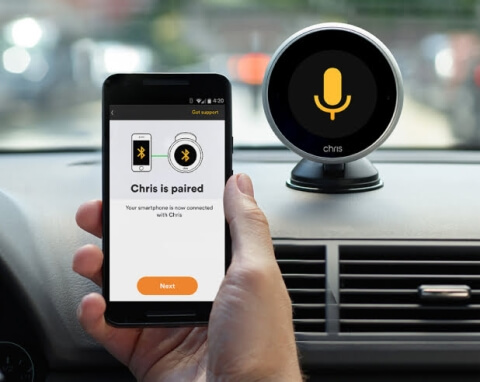
Create a native app for Android device users with our mobile applications development services. We have an established team of Android engineers who closely collaborate with UI/UX designers and QA specialists to build quality apps that leverage rich mobile functionality, including camera, BLE, and Wi-Fi. Our mobile apps developers stick to Google’s Material Design and Play guidelines, creating best-in-class mobile development solutions. Besides mobile, we use the Android tech stack to create AAOS apps for embedded infotainment systems in vehicles.
Tech stack
Flutter cross-platform development
Reduce time to market and save on costs with a Flutter-based cross-platform application. Flutter allows building mobile apps using the same codebase that work flawlessly regardless of the device. If Flutter’s capabilities cannot cover the needs of your project, our mobile app development agency can enhance the framework with native components, expanding its functionality.
Tech stack
Wearable app development
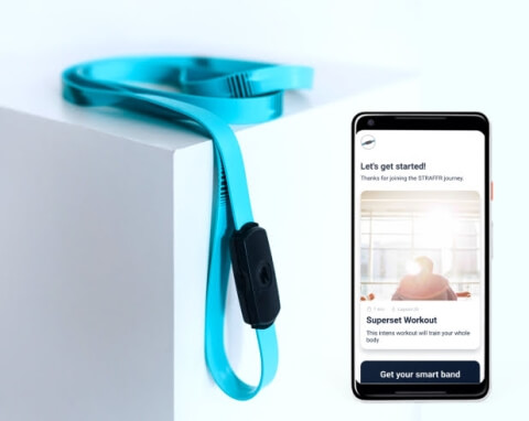
Make your app available on smart wearable devices to expand its uses and target audience. Our app-making company knows how to develop software with sleek UI for smart watches, fitness trackers, medical solutions, and other wearables. We can create a wearable app version as an addition to your mobile application or as a standalone app available for wearable only.
Tech stack
Our mobile app development process

Client experience
Lemberg Solutions' engineers were very skilled and very much engaged to our project. They gave their best for the project and didn’t hesitate to do overtime in order to meet the deadlines. There was also a great cultural fit. They developed very good relations with my team.

Services & Cooperation models
Why us for mobile app development
Flexible cooperation models
As a mobile app development firm that has been on the market for decades, we know that every client needs a custom approach to cooperation. One company may want solely mobile consulting services to get advice on a complex tech task and solve it internally. Another client may be willing to opt for full mobile app development outsourcing, from requirement gathering to deployment and maintenance. That’s why Lemberg Solutions offers four key collaboration models: discovery, product development, team extension, support & maintenance. They allow us to efficiently work on any project, adapting the scope of involvement and team size to the client’s needs.
End-to-end services
Whether you’re looking to reach iOS or Android users, or both with one app, you can rely on custom mobile application development services provided by our mobile team. Their robust experience with native and cross-platform mobile application development solutions, paired with our QA engineers’ effort, will make your apps offer the most efficient and secure performance regardless of the device. By ensuring your mobile apps work flawlessly across platforms, you can reduce time-to-market while maximizing your entire mobile ecosystem.
Qualified talent pool
Our staff is mostly middle and senior-level specialists, so you can rest assured the people building your mobile app development solutions have years of industry experience, and their feedback is a valuable addition to your product vision. On top of that, we have a certified project management office and well-established product development processes whose quality has been confirmed by the ISO 9001:2015 certification. You’ll be in touch with our team throughout the entire mobile app development process, making sure no detail is left out and benefiting from every good idea our engineers contribute.
15 years of experience
Lemberg Solutions has an enviable record of working with clients across Europe and America, with 15 years of experience and over 800 projects completed. We have a 200-person team of engineers, architects, designers, project managers, business analysts, and data scientists with offices in Ukraine and Germany. Such a large team allows us to provide clients with core software development services while the experience guarantees we do it properly. You may start with mobile app development company services and later request IoT engineering, data science, web development, or other engineering services if your project needs change.
Talk to our mobile engineering experts
Get in touch with Yevhen to discuss your application and learn more about our services.

Yevhen leads all mobile development projects at Lemberg Solutions.
FAQ
-
What mobile app development services can you get with Lemberg Solutions?
-
What is the cost of mobile app development?
-
How to choose a mobile app development platform?
-
Why you need a mobile app development company?
-
What is your mobile app development process?
-
We already have designs, can you work with those?


