With a single-page application design approach, you get another way of UI development that offers easy navigation and clear structure for single-page apps.
Let's say you developed an app that your target audience will use on an everyday basis. Your customers expect simplicity to not bother with a tricky layout all the time. Your design has to be intuitive, allowing users to handle the app without excessive instructions. A single-page design approach is a great option for eliminating navigation complexity, which the users will appreciate. The less cluttered the design navigation, the better they will feel interacting with your app.
How to achieve such simplicity through single-page application design? Nazar Konashevych, UI/UX Team Lead at Lemberg Solutions, shares his experience with the single-page app design approach below. Keep reading for practical insights and examples.
What are single-page applications?
Single-page apps (SPA) are web apps or native apps with one main page. You place nearly all your content within a single page, enabling users to navigate to all the critical functionality from it. All secondary pages start from the dashboard and connect to the related section on the UI. It ensures navigation simplicity and, as an extra bonus, space and clarity of your UI. SPAs are about space, interface simplicity, and omission of unnecessary components in designs.
Overall, we at Lemberg Solutions particularly like using single-page design for mobile apps. It's a new trendy design approach we recommend to our clients. This way, our team moves away from complex multi-page designs using techniques we'll talk about below.
Benefits of single-page application design approach
To make your app look more neat and attractive for end users, you can apply a single-page app design approach, and here's why:
- Clarity in navigation
Single-page design is an effective solution for avoiding redundancy in app navigation. Users can find all key components and menu elements on the first/main/home page or go directly to the necessary section. Remember the last time you surfed through YouTube or Google Play? These apps follow a single-page design approach and are super convenient to use.
- Better structure
Since interfaces in single-page designs don't overload the design, you can always prioritize the component location, emphasizing particular information as the most important. Additional tabs are usually created for extensive information. That’s why the single-page approach allows for more flexibility when you want to add new features and update your app.
- Harmonious look
Single-page designs help to keep balance between usability and extensiveness. It makes you avoid overkill but allows your design to remain rich and appealing.
These benefits of single-page applications ensure that your digital product will gain more popularity on the market. They also improve user retention by making the app convenient and clear.
Top tips on UX in a single-page application
Some product development companies may find it challenging to redesign their apps and get a simpler view to boost their apps' rates. We have done it a lot, so here is the list of tips to follow through the app design process:
- Use labels to provide more comfort for users navigating through your app. End users should easily understand the current context and what to do next. Make sure labels are simple and straightforward so that users won’t get confused.
- Add explanation texts to ensure end-users clearly understand the purpose of the page components.
- Arrange components on one screen, moving the settings icon to the top. Place other components closer to the center of the page, leaving space for the main content.
- Take up all the space with your components. If you realize that there's room for placing more icons on a single page, don't hesitate to do that. Smartphone manufacturers make screens wider, which is a huge plus for SPA design. However, that doesn't mean that you should eliminate all tabs, just make sure they are absolutely necessary.
- Stay concise to make a neat and simple app with a single-page approach, allowing users to access the core app functionality quickly. Ensure users don't waste their time scrolling to the needed app component or information. The faster users realize how to perform a specific action, the more positive experience they will have while using your single-page application.
- Enable tapping the component to get more data. As a result, you won't need to put everything in upper or lower bars. The app will become more interactive and engaging.
- Prioritize the lower navigation bar over the upper one. If you realize that the required number of components won't fit into one page, use the lower navigation bar and categorize the components. Such positioning is more convenient for users than components cluttered in the upper part of the page.
Real-life examples of single-page apps
A fundamental mission of UI/UX design is to improve user's interaction with your product and enhance their browsing experience. While developing numerous projects for our clients and refining their apps in each project iteration, we noticed that navigation panel can be cluttered with abundant icons and elements. Sometimes, they cloud be easily omitted.
Design for single-page applications revolves around making a landing page/dashboard that gathers the functions a user will need the most. This page is divided into logical sections the user can click and go to separate pages with more detailed information. To avoid using a common approach of putting important functionality in the lower bar, you can allocate navigation components through the contents of the whole navigation page. Let’s review single-page application design examples in more detail below.
Information architecture examples
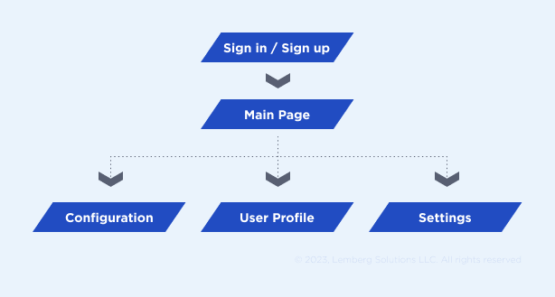
Let's take a look at this example: we need to develop a simple app with an authorization feature, analytics, configuration options, and general settings. Here is its information structure:
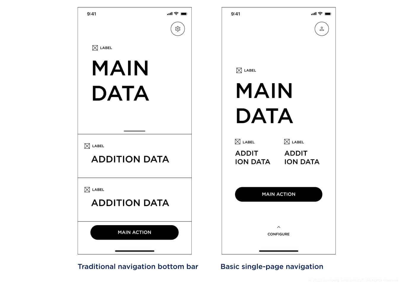
On the left, navigation spreads all over the screen, highlighting the most important parts of the main page. It’s a traditional navigation bottom bar. On the right, you can see the basic single-page navigation without the bottom bar. The settings are located at the bottom of the page.
There are different ways to build an app with a single-page application UI design approach. Applying a pager to the whole screen area is one of them (e.g. Shazam app has a similar structure).
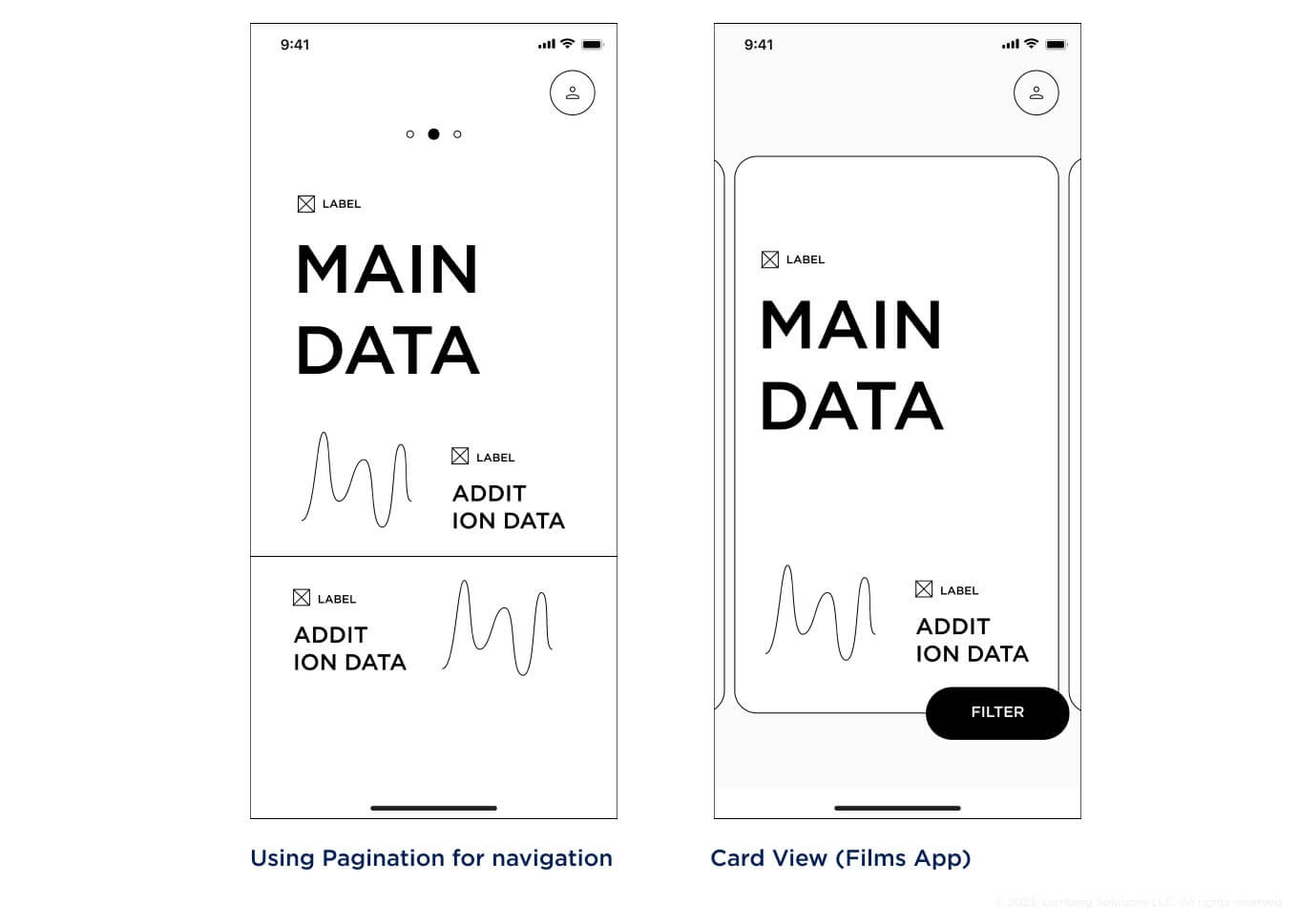
Using modal sheets, you can place additional settings in more unconventional areas of the screen, depending on what elements you need to prioritize. If your product scales and requires more app pages, you can add navigation among the existing content or use a driver menu and lower bar.
A user profile can be allocated in an upper navigation bar. Each content type can lead to a separate page with detailed information, while the relevant, up-to-date data will be displayed on the main page.
You can put the settings in the upper navigation bar or merge them with the user profile to turn them into account settings. If you need quick access to settings, add it to a relevant section on the main page. Now, the design looks neat and simple with a clear web pattern navigation-wise.
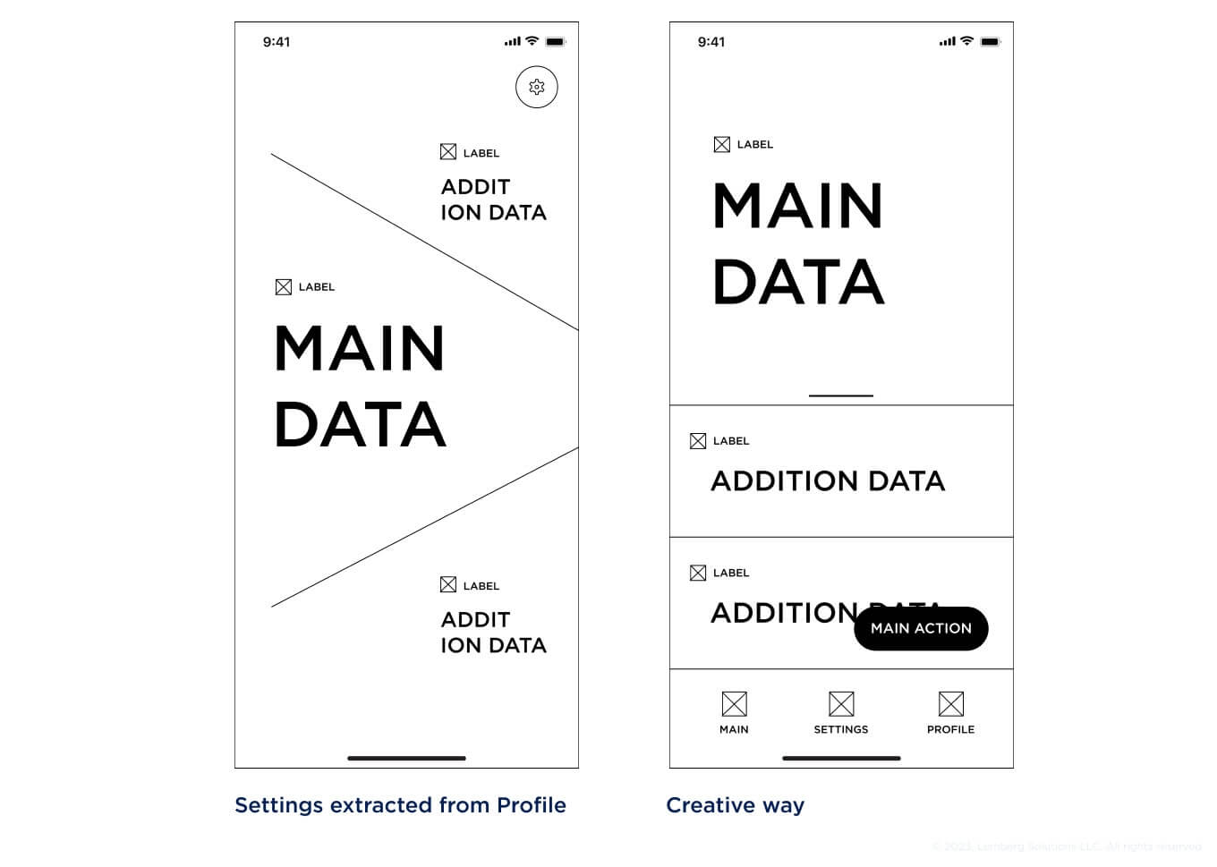
Mobile app examples
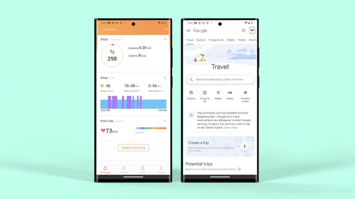
ZeepApp is a good example of a well-thought-out design. It has a lower navigation bar but employed properly. Let's take a look at the main page with plenty of analytical data that enables quick examination with the possibility to check more information on a separate page.
One more example worth your attention is the Starlink app with a main page showing variable data and a settings section in the lower bar. A more complex app will require a lower navigation bar, where you can place a settings section.
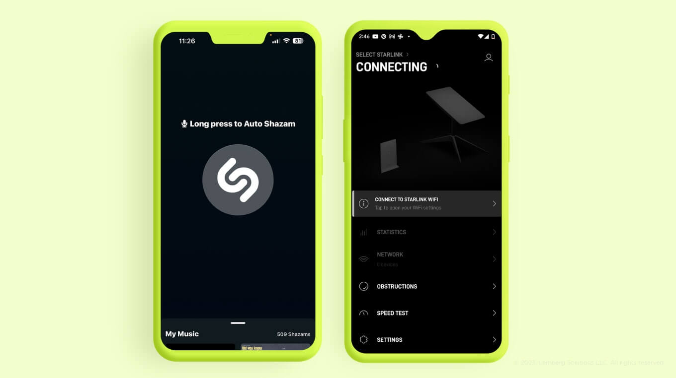
Here are more examples of effective single-page design, to name a few.
A single-page design for apps haven't flooded the market yet even though it ensures a positive user experience. A single-page approach helps avoid complex navigation system in an app, but don't hesitate to use a lower navigation bar if you need to put multiple sections on one page.
In the examples above, you can see a driver menu (or a hidden navigation menu). The best way to use a hidden navigation menu is for extremely complex apps with multiple pages (e.g., commercial marketplaces). However, if your app has numerous pages, you should revise an information architecture and user analytics. Find out which functions clients use the most and what pages they struggle to discover while using your product.
How our UX/UI team follows single-page app design approach in our projects
Simplicity and effectiveness of a single-page app design approach help our team develop high-quality apps for our clients. Here are some examples:
- Morning
For our client Morning, a premium coffee maker, and their iOS and Android native apps, we enhanced UI/UX and implemented a well-organized layout for user profile and coffee machine maintenance instructions. Our adjustments ensured ease of use and higher customer satisfaction. Learn more about the project here.
- Coboc
We helped Coboc, a lightweight e-bike manufacturer, create improved designs for their native Android and iOS apps that connect to Coboc e-bikes. Our design team also developed the designs and animations for the e-bike user onboarding guide to explain to end users how to connect the app to the device, start using an e-bike, and switch operation modes. Learn more about the project here.
Takeaway
Nowadays, designers strive to create apps without extra bars and menus. Why pile up all the information if you can divide it into user-friendly components? However, it only works for simple apps.
The main reason to try a single-page approach instead of other design methods is its intuitiveness and ease of use.
If you are puzzled over mobile app design and want to attract more users to your product, the design team at Lemberg Solutions will pull you through this challenging task. Moreover, our developers can help you create the app from scratch the way your users will love it! Feel free to reach out to us via our contact page.

FAQs
What is a single-page application?
Single-page apps contain one main page with the most useful information and features. By clicking on different components of the page, users are redirected to other pages with additional information. SPA design allows for conciseness and smooth navigation through the app.
What is a good example of a single-page application?
A good example of a single-page mobile app is Shazam. It includes the main button right in the center of the screen and additional features at the top. Using Shazam, you don’t get lost in the app and have quick access to its most important feature.
What is the difference between a web app and a single-page app?
Traditional web apps are mostly made for read-only purposes without the need for much interaction with users. Single-page applications are for more dynamic content and complex structures, enabling end users to explore the app and use it to the max.

