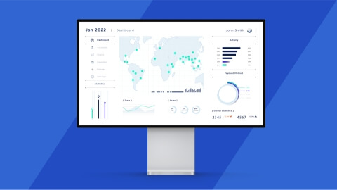
The product dashboard is the main page that uses a single interface to combine product overview information and provide quick access to its functions and user data.
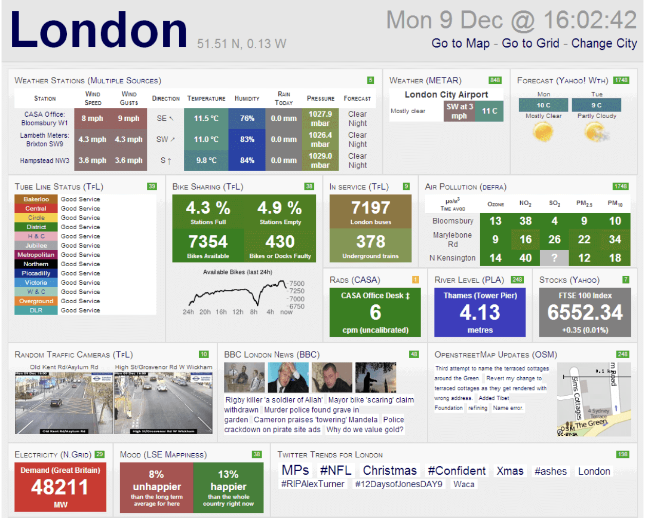
The dashboard is one of the core elements of any type of software. Its purpose is to present analytical information via graphs and charts, making it readable and straightforward for users.
A consumer electronics dashboard is a product database where users can find relevant information regarding product usage, actions, accounts, installed apps, etc., in one place.
Would you like to know what makes a good dashboard? Let's discuss what UI design components of the dashboard are must-haves and what practices you should follow to create a functional dashboard UI design.
Why dashboard design matters
The role of a high-quality dashboard design is to structure vast amounts of information in easier and more readable ways for users.
In addition, a convenient and intuitive dashboard design speeds up the search for required information. Dashboards ensure convenient management and monitoring of specific content, which in our case is product navigation.
“Good design is obvious. Great design is transparent.” — Joe Sparano
Main types of consumer electronics dashboards
Basically, there are two main types of dashboards — operational and analytical. They are divided by the type of information they provide users and can be combined within a single dashboard.
1. Operational
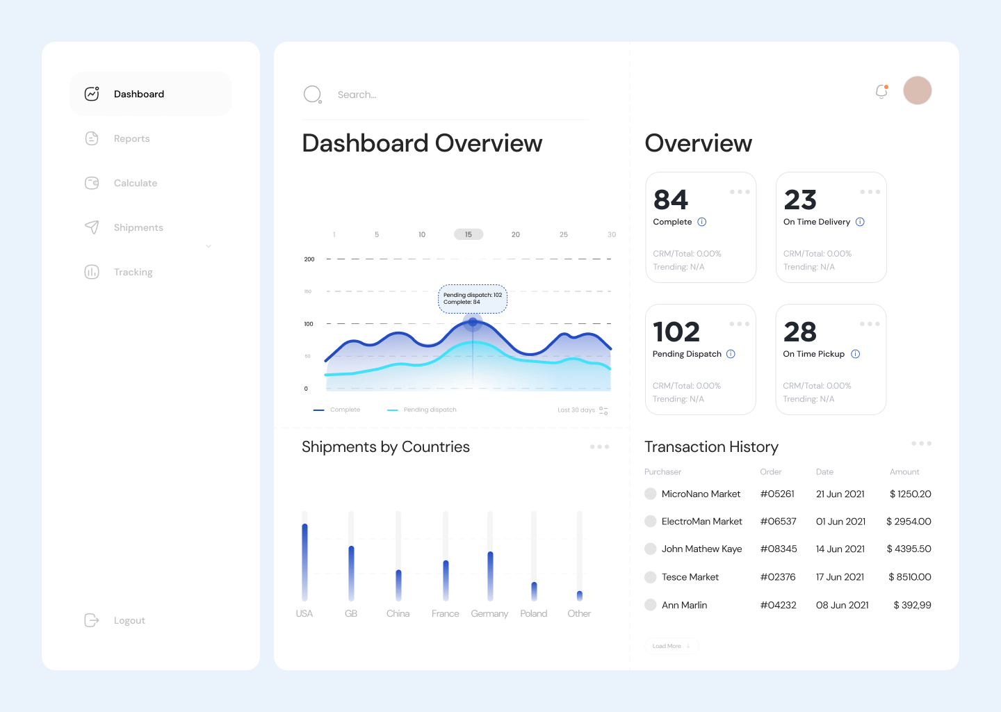
Operational dashboards provide users with real-time information. Loading information takes several seconds before displaying it on the screen. This dashboard type allows users to quickly revise data changes throughout the day. Although it doesn't show deep analytical data, it updates recent information.
2. Analytical
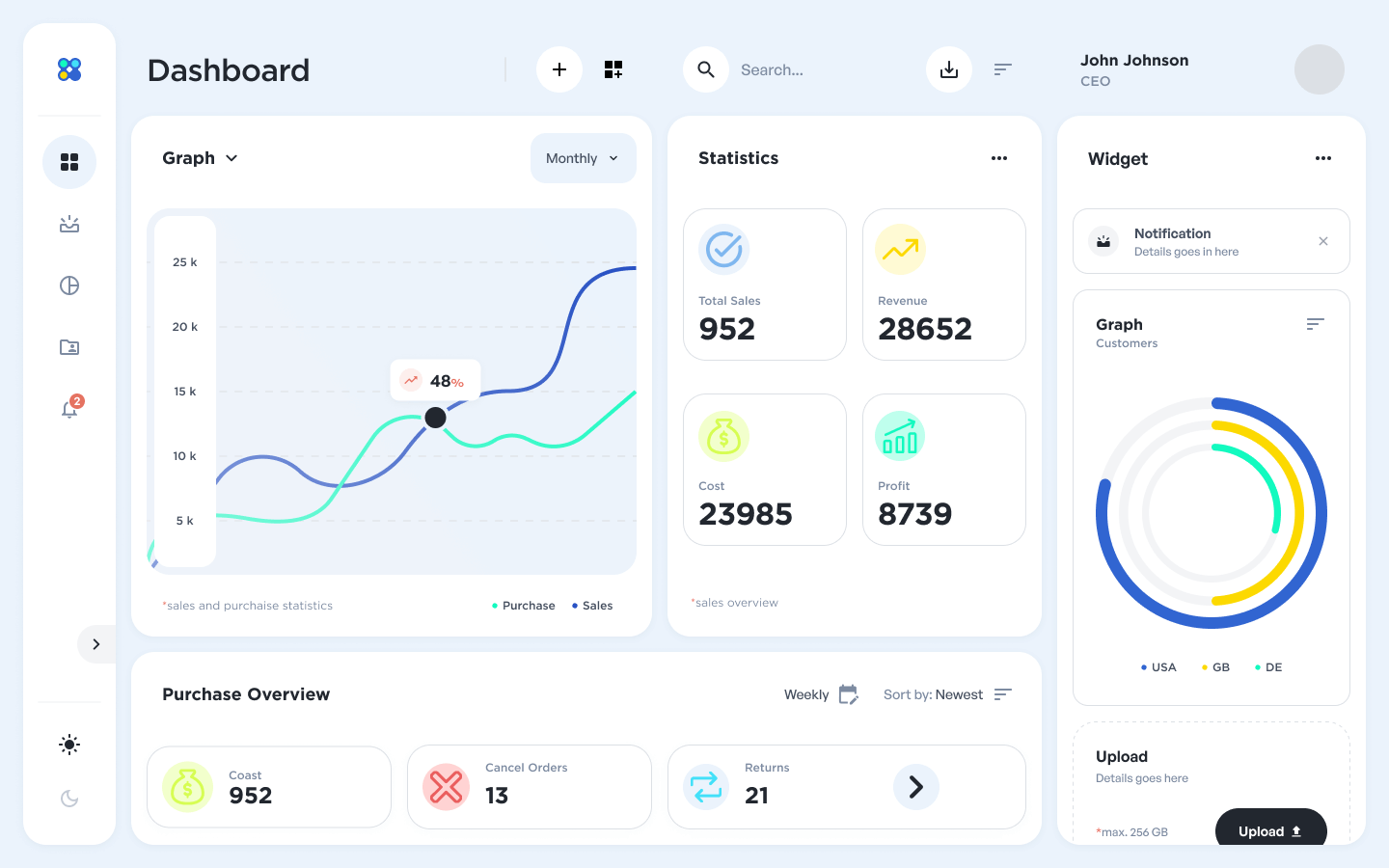
The analytical type of dashboard is used to process and analyze vast amounts of data. The analytical dashboard aims to convert complex data into readable and structured information.
The more information users can access, the more they can learn about your product and their individual activity. However, this type of dashboard may require a bit longer and more complex user onboarding and data loading.
Core components of consumer electronics dashboard design
Overall, the creation of dashboard UI designs for consumer electronics needs to follow three main criteria:
- Split the design elements into primary and secondary groups.
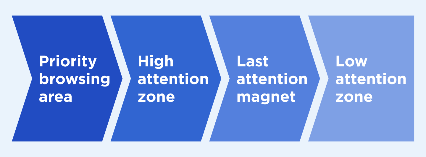
- Build the correct information architecture and navigation (primary categories are at the top, and the secondary are located lower on the page).
- Bear in mind Jacob’s Law, which entails making the designs similar to other similar products on the market and which is the reason for so many identical product designs among different manufacturers. When users see the dashboard of your product, they expect it to work like similar products they have tried before, so it is recommended to use familiar patterns – not to overload users.
Common dashboard design mistakes and how to avoid them
Before we move to successful dashboard design principles and solutions, let's define what affects the quality of the design in general.
A low-quality consumer electronics dashboard contains excessive, unstructured, and irrelevant information for users when icons don't correspond with the functions they lead the users to.
What are other common mistakes designers make when creating dashboards? Let's proceed with the list below.
Excessive and irrelevant details on the screen
The dashboard aims to inform users by interpreting complex data related to the product in a clear form. There is no need to place irrelevant icons, pictures, links, or images on the dashboard. It may deter users from the main reason they originally visited a page.
Complex charts and infographics
Structuring the information into charts and infographics doesn't always work. You should use simple language to make your offer clear for all users. Convert some data into figures instead of long sentences and pick the relevant colors and fonts to make the dashboard more readable and convenient.
Wrong colors and fonts
The dashboard design needs to follow the color theory, where clashing colors cannot be placed within a single interface. The same relates to fonts, infographics, and charts, which make the dashboard look messy instead of clean and easy to navigate.
Poor-quality media
Charts are placed not for visualization but to make valuable information easier. Hence, they shouldn’t be blurred or empty. If you want to dilute the page content, use relevant images and icons with high resolutions.
If you place the infographics for dilution purposes, ensure they bring users appropriate insights. Otherwise, the dashboard may look appealing until users start exploring it.
Time-consuming dashboards
The main point of a dashboard is to simplify product navigation for users, not the contrary. The search within the dashboard should take no longer than several minutes. A time-consuming dashboard equals bad dashboard design.
Read also: 5 Tips to Make Your UI Design for an IoT Dashboard Work
Signs that your dashboard design needs an upgrade
An average user cannot define what is right and what is wrong regarding dashboard design. Nevertheless, if the dashboard is inconvenient to use, it’s a red flag concerning your dashboard design.
We asked our top-notch designers to outline the components of outdated and poor dashboard designs to help you provide customers with improved services:
- Non-intuitive design
User onboarding takes too much time and money.
- Inconvenient page elements’ location
For instance, a user tries to find a certain page, the link to which is located inappropriately, e.g. the search filter is placed near the search bar instead of the search button.
- Poorly readable content
The titles are not clear and the content doesn’t answer users’ requests.
- A wrongly selected option for data visualization
It can cause issues with collecting and analyzing data.
6 best practices to make consumer electronics dashboard design work
These tips will help you avoid the common mistakes we mentioned above and build responsive and functional dashboard designs.
1. The dashboard is for users
Users should be at the center of your attention when you create dashboard designs. To make it appealing and readable for them, designers need to know their potential users. An understanding of the target audience allows you to personalize the dashboard design.
Answer these questions to research potential users:
- What kind of information do they expect to see?
- How much time do they expect to spend surfing the dashboard?
- What information is valuable for them?
It is essential to keep in mind the customers' needs and expectations when considering design trends and the appearance of the future dashboard.
2. Design layout as a basis
One of the main steps in creating dashboards is to create a dashboard core — meaning the page structure with all the components it will contain. Instead of placing the charts and data right away, this gives the capability to deeply focus on what information and where you should place them, what media and charts to add, how they will look, and so on.
Mind that the top of the dashboard catches the most attention of users, especially the top left corner of the page, so insightful data should be placed there first.
3. Provide an option of dashboard personalization
The main task is to create a core dashboard that is easy to navigate and contains relevant and readable information and media.
Dashboard personalization enables users to change the page layout, meaning the location of design elements within the dashboard, like frames, tabs, etc. This feature is necessary for their convenience and specific preferences.
4. Simplicity should be on top
Dashboard design is about complete simplicity for users. Make the information easy to read, while you should avoid excessive icons and irrelevant content.
It is better to leave white space on the page instead of filing it with ridiculous images or excessive information that will not come in handy for users. However, it is also important to keep the correct sizes of white spaces within the page to avoid turning them into negative ones.
5. Well-grouped and structured information
Dashboards usually contain general information regarding different fields. For example, the user activity dashboard on the iPhone shows the range of apps you use, how much time you spend using them, how much time the screen is on, how many app notifications you get, etc.
Thus, the information should be split into logical groups with structured content in each group. If we talk about consumer electronics, as with a smart TV’s dashboard, there may be displayed a variety of installed and used apps during the last day or week. It can be login information to these apps and other accounts, providing quick access to these apps, payments for subscriptions, and other types of data. This information should be divided into different categories with logical titles and structures.
6. High loading speed is pivotal
The data loading process may take time. So, it is important to add a corresponding dashboard UI to display the data loading progress, showing how much time is left.
The average acceptable loading speed for dashboards is no longer than 6 seconds.
The flow of dashboard development at Lemberg Solutions
Further, we want to share the dashboard designing process we follow at Lemberg Solutions in order to release a product that meets the demands of our clients and their final users.
Phase 1: discovery
Foremost, we perform the discovery phase, which aims to explore the target audience, their preferences, and expectations for the dashboard’s appearance and functionality.
If your product already has a dashboard with an outdated design, we then conduct a product audit. The dashboard is tasked with simplifying product navigation for users, so it is important to explore what issues the users faced before in order to fix them in the dashboard creation process.
Phase 2: architecture
This step determines the core features of the dashboard and how these features and data can be logically placed within the page architecture.
Phase 3: wireframes
The next stage is building the design wireframes and the rapid prototype to display how the final version of the dashboard will look and what functions it will provide. This design will be clickable to test the page data architecture and features.
Phase 4: development
This is the actual dashboard development and designing process according to the previously outlined requirements. After this phase is completed, QA specialists, clients, and test users test the dashboard to ensure everything runs smoothly.
Summing up
To make the dashboard design work, keep in mind the logical and simple rules regarding the displayed information and its allocation within the page. Users are at the center of attention, which means they need to understand everything they see on the screen and intuitively know what further actions they need to take.
If you still have questions about your product dashboard design or are looking for a provider of mobile app development services to create a dashboard from scratch, contact our design team to discuss the details.
