How can you ensure the maximum usability of an IoT dashboard for end users? How can doing so potentially help your business? If your project is at the stage where you need to answer these questions, it’s time to dive deeper into IoT dashboard design and learn some not-so-obvious tricks.
In this article, I share practical tips on how to ensure transparency and visibility in the design of IoT dashboards to make using your device intuitive and convenient.
Why does the IoT dashboard matter?
The success of IoT devices is not just tied to hardware performance. Your end users also need to have a positive experience with your product. To control device operations, users have to receive real-time data about numerous factors such as temperature, humidity, and location, depending on the purpose of your IoT device. You’ll also have to ensure that all crucial information is visualized so users can analyze it fast, which requires proper UI design.
To reduce the decision-making time for users, IoT dashboards must be intuitive. For example, say you’ve created a smartwatch and a fitness app for users to track their physical performance during workouts. The main information they want to see immediately is the distance covered and the time spent working out. You have to make sure they won’t be distracted by a big weather widget or data that is of secondary importance. If users are distracted, it can lead to a situation when they find your app challenging to use and avoid it.
When designing an IoT dashboard, the easy path is to choose an IoT plug-and-play platform, like Microsoft BI, Azure IoT Central, and Grafana Labs. However, if you are looking for a stable, future-proof solution and aim at developing an individual IoT system without data visualization restrictions inherent to the services mentioned earlier, custom design will be a better option.
How to make your UI design for an IoT dashboard work

Tip #1 — Put the product’s purpose first
The first thing you have to keep in mind while designing an IoT dashboard is the aim users want to achieve with its help. Think about which functions your device performs and choose dashboard components and tools that will best serve your product’s purpose.
If your device monitors environmental quality, be it for growing plants or taking care of animals, the most important indicators usually include temperature, humidity, and air quality. In this case, what is most important for the user is getting real-time notifications when any of these parameters deviate from the norm. However, if your device is for tracking an object’s location, these indicators will be irrelevant, and their presence on a dashboard will be distracting. Before even starting the design phase, you need to decide which components are indispensable to work with your IoT solution, place them on the dashboard, and visually emphasize them.
Deciding what dashboard elements are of primary and secondary importance requires your team members to brainstorm numerous ways of using your device and decide which elements are indispensable. You can employ dot voting in such brainstorming sessions. With dot voting, each discussion participant gets a number of dots they can assign to the elements they believe to be the most appropriate (whether in terms of cost, complexity, or criticality). Paying attention to visual hierarchy is key to effective design, and you should discuss it before launching the design development process. Starting with a discovery phase, during which you outline what should be included on your IoT dashboard, will ensure a smooth design development path.
Tip #2 — Prioritize components
An IoT dashboard should be a helper, not an obstacle. Your design should emphasize the most important parts of the dashboard or those used in case of emergency (stop or SOS buttons, for instance) so the user can find them quickly. You shouldn’t add everything (including data that doesn’t bear critical business value) to the main screen of your IoT dashboard, since it will make the dashboard look cluttered and make it hard for end users to navigate. In the book The Design of Everyday Things, Don Norman describes an accident at the Three Mile Island nuclear plant that almost caused a radiation release in 1979. Analyzing the root causes of the accident, Norman concludes that poorly designed control dashboards that didn’t take into account human factors resulted in the disaster. Always remember that your product is used by people, and you need to consider their behavior to make a dashboard user-friendly.
For systems that include safety alerts, you should consider the position and color of the alert pop-ups. For instance, the visibility of safety alerts will be critical for automotive manufacturing companies since monitoring conditions on a production floor to avoid equipment breakdowns is key to continuous production. Machine operators will have to react quickly if something happens and their device sends them an alert.
We’ve established that the critical elements of your dashboard should be eye-catching. But how exactly can you draw a person’s attention to them?
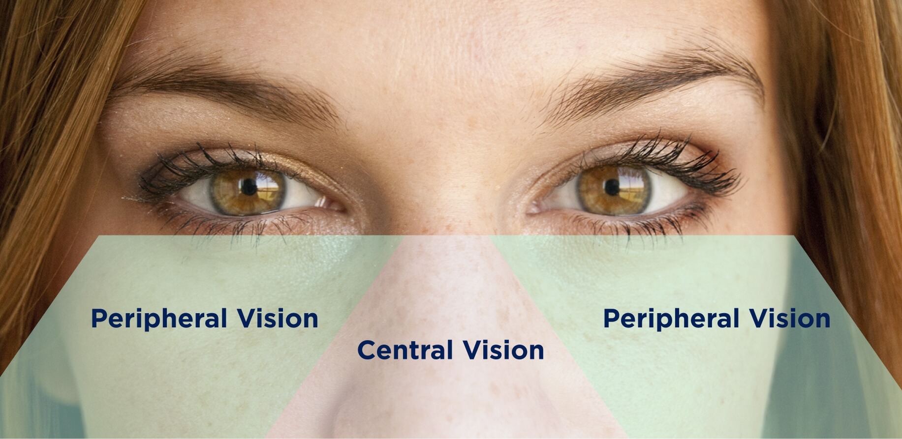
People’s focus is first drawn to the center of any composition. That’s why you should align the most important dashboard elements to the center of the screen for easier reading. You can see this rule is applied almost everywhere, from your Facebook feed to standard web pages. You might have noticed that even this blog has specific width limits for a better website experience.
In the book 100 Things Every Designer Needs to Know about People, Susan Weinschenk mentions that people’s brains react faster when an object appears in their peripheral vision compared to their central vision. For this reason, it’s better to place notifications at the screen edges, as users will rapidly react to them. Advertisers who know this trick usually put ads on the sides of the screen and add animations or flashing elements to attract readers’ attention. For critical alert messages, you can apply flashing and the rule of centering to make users swing into action as soon as they see the pop-up.
Additionally, Jakob Nielsen and his colleagues conducted a study showing that, as a rule of thumb, people read content following an F-shaped pattern. First, the reader focuses on the upper area of the page and moves horizontally. Then, they go a little bit lower down the page and make the next horizontal movement, covering a shorter distance than the previous time. Lastly, they move vertically down the page, sticking to the left side of the content area. That’s why you should put critical elements at the top of your IoT dashboard so end users notice them quickly.
You can play around with the position of components on the screen to check which arrangement works best. The proper visual hierarchy of dashboard UI elements allows the user to recognize essential components first and then move to less important ones. If you properly organize the screen layout, the users’ journey through the app will be smooth.
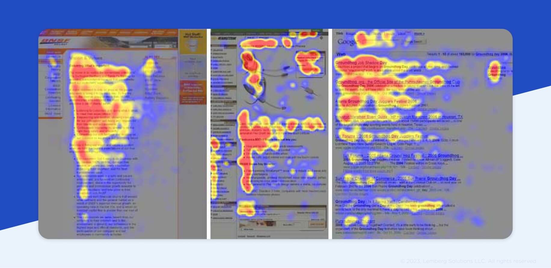
Using this knowledge, you can arrange specific pieces of information so they stand out. Put the most crucial data in the small area at the top of your dashboard and accentuate it with the help of font weight and colors where needed. But beware of mixing fonts — if you combine more than two fonts in an app, the design will look heavy. This will impede users while working with your app because they will get lost in the variety of typefaces. The Google Fonts library is full of free font designs, and you can use it to choose the best font for your product.
Tip #3 — Choose the right form of data visualization
There are numerous ways to visualize data, and you should choose those that best fit the type of information you’re going to display. Creating a data representation model may help you organize data chunks and recognize their relation to each other. Always remember to optimize dashboard space and distribute information evenly throughout the screen.
But how can you decide which form of data visualization works for you? If end users will work with variables like temperature, currency exchange rates, or any information given as statistics, the easiest option is to display data in charts. Visualizing data in the form of widgets is usually suitable for demonstrating progress, as in fitness trackers. A table view is of the greatest help when you need to monitor several parameters simultaneously or sort them out for more efficient data management.
Data visualization ensures that the end user can analyze mistakes or deviations after they have happened. A line chart fits this purpose best because it demonstrates parameter changes over time. If your end users need to determine the number of deviations or mistakes, it’s better to provide a heatmap with pinned events and locations.
Tip #4 — Consider the context of device use
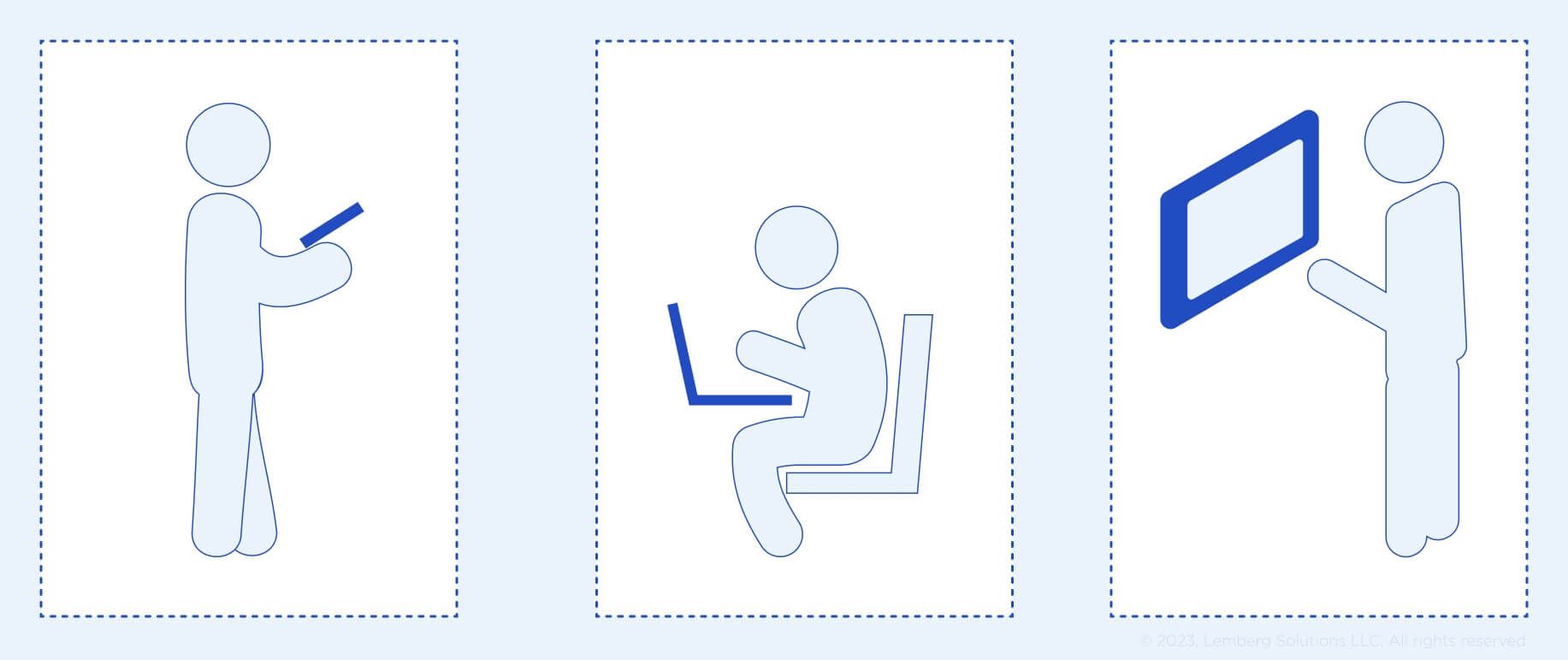
The core task of a user-friendly interface is to provide fast access to necessary functions. To do so, you should focus on a device’s context of use: Will the end user hold the device in their hands or will it be stationary? How exactly will the user access the dashboard? Will the screen be big or small?
More and more industries are integrating human-machine interfaces (HMIs) to automate production and other processes. Users expect easy interactions with HMIs that are as intuitive as with their smartphones. That is why your design should allow end users to rapidly react to any deviations for painless remote control of your device.
Tip #5 — Important elements shouldn’t always be red
Pay attention to the color palette you use. Think about the primary color of the dashboard — which background theme will be most suitable for end users? Next, make the control panel elements look prominent, establishing contrast between them and the background. Some colors should be brighter, while others have to be toned down to not overshadow crucial parts of the screen.
These pieces of advice can also be applied to the context of your device use. If your workers on the production floor wear orange uniforms, the main buttons shouldn’t be orange because they will merge with the environment.
The effect of colors on people also plays a significant role in dashboard UI design. Do you know why car and aircraft manufacturers started using orange and green dashboard lights? These colors are the least tiresome for drivers and pilots since, in terms of human psychology, orange is associated with fire and safety, while green is the color of our natural environment.
How we developed web dashboards for IoT projects
Hygiene monitoring and activity tracking system
As an example, I will consider the process of designing a dashboard for our client Barkom, a Ukrainian agricultural company that specializes in growing pigs and cattle and selling self-produced food products. Barkom asked Lemberg to develop an IoT device and an app for monitoring staff hygiene to prevent infectious diseases from entering the farm. We had to ensure a clear visualization of each employee’s showering quality to keep out those who washed poorly and avoid contamination of the whole drove of pigs. It was crucial to visualize data so that end users could swiftly recognize deviations from the norm.
First, we came up with a card view data visualization to add information about the number of employees’ washing procedures. To help the client track the statistics of each employee, we added the weekly and monthly average number of minutes employees spend in the shower.
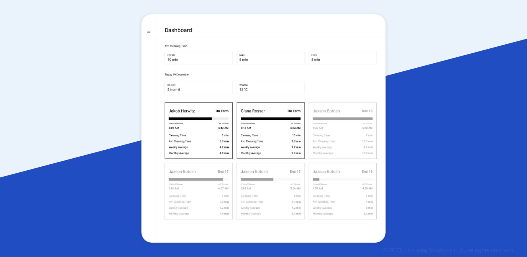
After several modifications, our designers decided to focus on circle progress bar style widgets for the IoT monitoring dashboard.
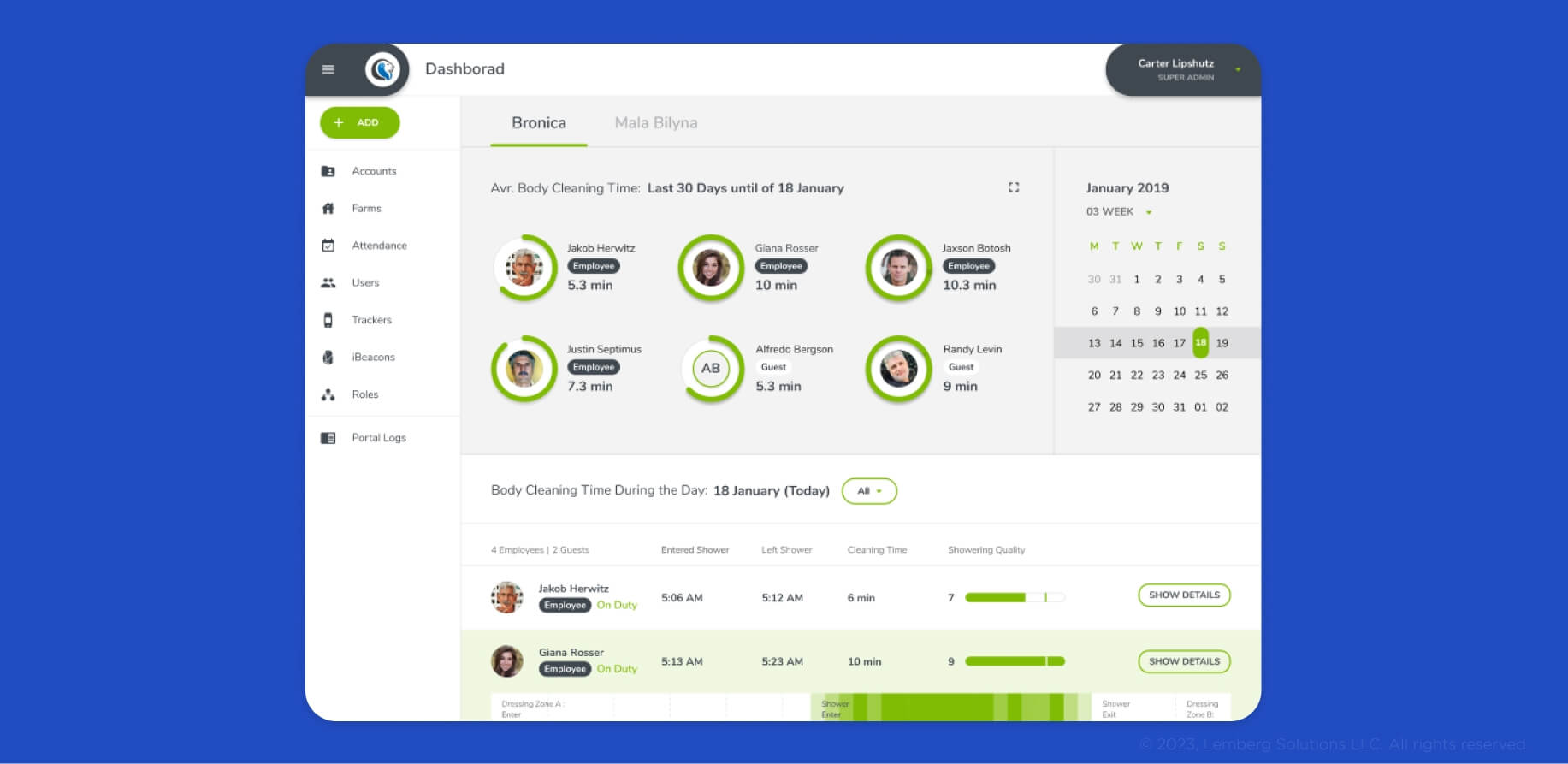
This allowed us to arrange detailed information in an easy-to-perceive way. We designed widgets that show the time employees spend in the shower (if a green-colored circle around a widget is full, it means that an employee met the minimum time that has to be spent in the shower), a calendar to check the average number of shower minutes in any given month, and even a washing intensity metric. If the employer needs to see more detailed information, they can click on the widget and see when a worker entered and left the shower room.
A smart hydroponic system for growing microgreens at home
When we developed a dashboard design for smart greenhouses, our client asked us to put the principal tabs and buttons on the right side of the screen. This ensured more efficient work for employees because the core data was displayed on the dashboard’s center, while the tools to work with it were on the right. In addition, they requested large buttons so users wouldn’t struggle with finding them on a small screen. We also made a sleep mode notification to indicate that a device wasn’t used for a while.
IoT telemedicine platform for cough sound recognition
For Carepath, a telemedicine platform for monitoring symptom-specific data in a home environment, we developed a mobile app with an analytics dashboard representing quantitative data and analytics. Our team settled on using a bar chart because the client’s data changes dynamically, and users found it easier to perceive information with a bar chart compared to the 3D chart visualization we developed before.

Wrapping up
The discovery phase is an essential aspect of project development that should be carried out before creating a design. It helps to understand end user experiences for designers to adapt the dashboard to users’ needs. A discovery phase is a chance to avoid multiple mistakes by answering these questions:
- What is the purpose of your product?
- Which elements should be added to the dashboard?
- How should those elements be prioritized?
- What is the context in which the device will be used?
When the discovery phase is over and you start designing the dashboard, don’t forget about the essentials, whether you’re a designer or an IoT product owner:
- Your component selection should depend on the device’s purpose.
- Don’t make a heavy design that harms the user experience.
- Choose a form of data visualization based on the type of data you provide.
- Keep your target audience in mind while considering the position of components.
- Consider the context in which your product will be used when picking a color palette.
Dashboard design can make or break your IoT product — and you certainly don’t want it to break it. The tips in this article are only the first steps in developing a successful IoT dashboard, but they are essential if you want to get (and stay) ahead of the pack on the IoT market. The best way to ensure that everything will work out how you planned is to cooperate with a company experienced in IoT development services.
Many nuances of design depend on the industry and development peculiarities, and sometimes you just can’t predict what may go wrong without advice from an expert. If you’re looking for a team of professionals to help you with your IoT solution, from hardware development to dashboard UI design, visit our contact page and reach out to our experts.

