Layout Builder (LB) is a Drupal feature enabling the creation of visual layouts fast and painlessly. It gives you flexibility in customizing your content look, making it structured and user-friendly. With this tool, you can also access a visual preview that will help you understand how all the blocks on your website will be compatible with each other. On top of that, ecommerce websites require consistency in the visual part to make a user's journey easy and interactive.
But Drupal LB can give you so much more than just a compelling UI.
Businesses owning eсommerce websites need a tool that quickly generates a mailing list to inform the audience about discounts, shares the news, etc., and Drupal LB is the first thing you should turn to for these purposes.
In this article, I will share the ins and outs of how to make a great newsletter using Drupal LB. You’ll learn: how to prepare a block structure for building a newsletter, what should be known before starting the development, and how to test the results before mass mailing. Dive in!
Possible complications with email clients
Before starting with a letter template, it's important to determine which email clients you are going to support. Sometimes the base of each email is HTML5, a background image is set, and typical button styles are applied to a link. In Gmail, such emails look great, but the moment a developer receives a copy of the letter in Outlook, they get surprised with a messy view.
Specific rules and guidelines should be followed to make the letter look the same in as many email clients as possible. Some email clients require typesetting similar to a text editor, which means excluding positioning, negative values, grid, flexbox, and other benefits of CSS. As a rule, these features can be freely used for typesetting sites but cannot be applied to specific email clients.
The pseudo-elements like ::before/ ::after should not be employed since they aren't supported by numerous email clients. I've noticed the same problem with @media support. Additionally, font support won't allow all versions of the letter to be the same. I recommend paying attention to the CSS support list.
Outlook is the email client that gets more attention, because development should be started with the most demanding client. Don't forget that Outlook webmail (outlook.com) is radically different in its capabilities from the Outlook desktop app because the webmail version uses the browser's capabilities to render content.
An interesting fact
Outlook desktop on Windows supports fewer features than on macOS. For example, you won't be able to use a CSS “background-image” for Windows.
Content preparation tips
Let’s prepare a Newsletter content type for mailing. It includes a title field and an image that will be used as the title background. Using Drupal Layout Builder blocks, you will add all internal content. But first, you should prepare templates for the following demo blocks: Text & images and Product list.
Apply "image style" to all images that will be used for mailing, since a free-size image can shift the content by increasing the width of the letter container. I strongly recommend making sure that all images have "width" and "height" attributes.
All links and images must have an absolute path, even though images often have a relative path.
However, this won't work with email clients. The path must also start with "https," since images connected via "http" may not be displayed. So let's add the variable "host" for further use in blocks so that the site path looks the following way:
"https://mysite.com/some/path/to/file"
instead of the relative:
"/some/path/to/file"
function mytheme_preprocess_block(array &$variables) {
 $variables['host'] = \Drupal::request()->getSchemeAndHttpHost();
}
Create logo and icons in PNG format since SVG images may not be displayed in the letter.
Let's prepare a node--newsletter--full.html.twig template for the content type:
{% set rendered_content = content|without('field_newsletter_image') %} {# Get all content except for the image field #}

<table class="newsletter full"> {# This wrapper was <article> by default. It’s used for setting a gray-colored background #}
 <tbody> {# If the <tbody> isn't added, Drupal will do this #}
   <tr>
     <td>
       <table class="newsletter-table"> {# This is used for the main content #}
         <tbody>
           <tr>
             <td>
               {# This table is a header with an image as background. #}
               {# For easily setting “image_style” install Twig Tweak module or generate the image path in the .theme file #}
               <table class="newsletter--header" style="background-image: url({{ host ~ file_url(node.field_newsletter_image.entity.fileuri|image_style('newsletter_image')) }})">
                 <tr class="newsletter--header--tr first">
                   <td>
                     <a href="{{ host }}" class="logo-link">
                       <img src="{{ host ~ base_path ~ directory }}
/images/logo/logo-white.png" alt="ShopName logo">
                     </a>
                   </td>
                 </tr>
                 <tr class="newsletter--header--tr second">
                   <td>
                     <h1 class="title">{{ label }}</h1>
                   </td>
                 </tr>
               </table>
             </td>
           </tr>
           <tr> {# Contains main content #}
             <td>
               <table class="newsletter--content">
                 <tr class="newsletter--content--tr">
                   <td>
                     {{ rendered_content }}
                   </td>
                 </tr>
               </table>
             </td>
           </tr>
           <tr>…</tr> {# Contains footer content #}
         </tbody>
        </table>
       </td>
      </tr>
     </tbody>
    </table>
Basic styles:
table {
 width: 100%;
 border-spacing: 0;
 border-collapse: collapse;
}
.newsletter.full * {
 box-sizing: border-box;
}
.newsletter.full tr {
 border: 0;
 padding: 0;
 background-color: transparent;
}
.newsletter.full > tbody > tr > td {
 padding: 50px 20px;
 background-color: #D6D6D6;
}
.newsletter.full .newsletter-table {
 max-width: 700px;
 margin: auto;
}
.newsletter.full .newsletter--header {
 min-height: 350px;
 background-repeat: no-repeat;
 background-size: cover;
 background-position: center;
 border-radius: 10px 10px 0 0;
 overflow: hidden;
}
@media (max-width: 767px) {
 .newsletter.full .newsletter--header {
   min-height: 300px !important;
 }
}
.newsletter.full .newsletter--header tr td {
 border: 0;
}
.newsletter.full .newsletter--header tr.newsletter--header--tr.first > td {
 height: 100px;
 padding: 36px 36px 20px;
 background-color: rgba(0, 0, 0, 0.3);
}
@media (max-width: 768px) {
 .newsletter.full .newsletter--header tr.newsletter--header--tr.first > td {
   padding-left: 15px !important;
   padding-right: 15px !important;
 }
}
.newsletter.full .newsletter--header tr.newsletter--header--tr.second > td {
 padding: 0 36px 98px;
 background-color: rgba(0, 0, 0, 0.3);
 vertical-align: middle;
}
@media (max-width: 768px) {
 .newsletter.full .newsletter--header tr.newsletter--header--tr.second > td {
   padding-left: 15px !important;
   padding-right: 15px !important;
   padding-bottom: 60px !important;
 }
}
.newsletter.full .newsletter--header .logo-link {
 display: inline;
}
.newsletter.full .newsletter--header .logo-link img {
 display: inline-block;
 width: 80px;
 height: auto;
}
.newsletter.full .newsletter--header .title {
 margin: 0;
 text-align: center;
 font-size: 48px;
 line-height: 1.2;
 font-weight: 700;
 color: #fff;
}
@media (max-width: 768px) {
 .newsletter.full .newsletter--header .title {
   font-size: 36px !important;
 }
}
Wrap the styles in a <style></style> tag and paste it into the twig file. Use emogrifier to apply the styles to the HTML code.
Let’s take a look at the result:
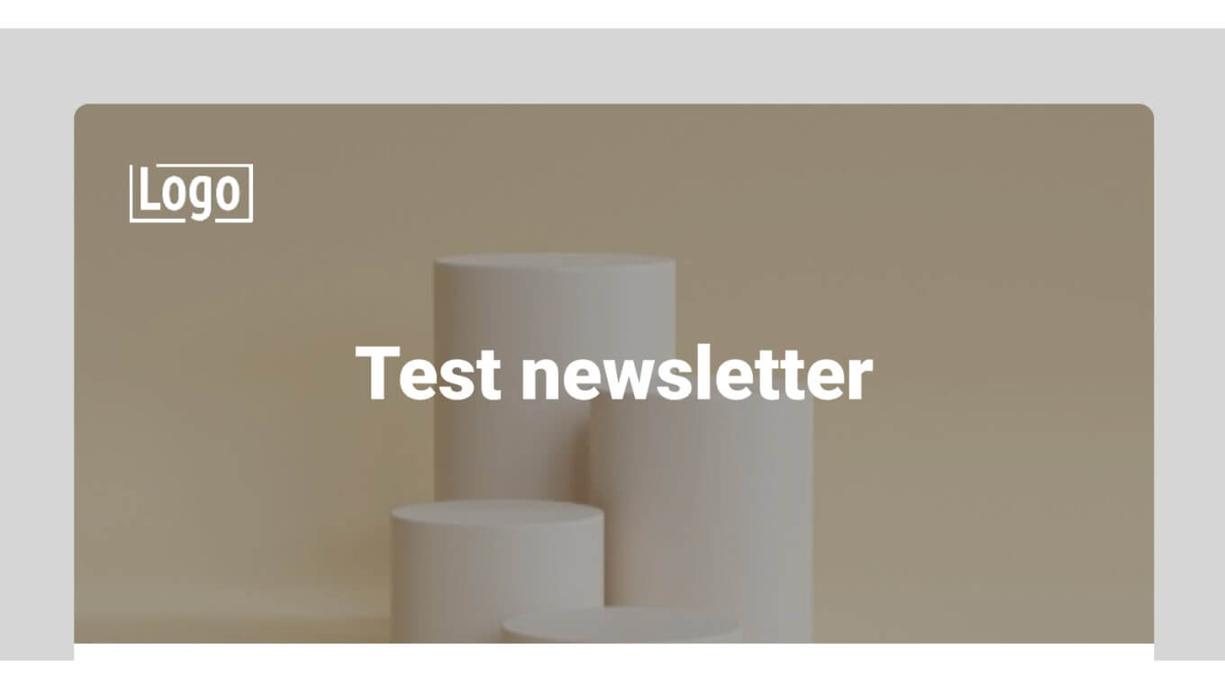
Styles have been added to tags, but @media query styles will be passed raw in the email. The priority will be lower than the styles written in the tag attribute, so use the "!important" rule.
One more tip: apply a 1-column LB layout so the layout itself doesn’t require changes to its default HTML structure.
Let’s add suggestions to the blocks based on the content type. This will allow us to include specific templates for the blocks that will be used only when displaying content on the Newsletter content type pages. This is needed to keep such templates separate from their default display elsewhere on the site. Here are some examples:
function mytheme_theme_suggestions_block_alter(array &$suggestions, array $variables) {
 $node = \Drupal::routeMatch()->getParameter('node');
 if ($node instanceof \Drupal\node\NodeInterface && $node->bundle() == 'newsletter') {
  // Suggestions for Custom block bundles.
  if (isset($variables['elements']['content']['#block_content'])) {
    $suggestions[] = 'block__custom__newsletter__' . $variables['elements']['content']['#block_content']->bundle();
   }
   // Suggestions for Offers view block.
   if ($variables['elements']['#plugin_id'] == 'views_block:offers-offers_block') {
     $suggestions[] = 'block__custom__newsletter__offers_view_block';
   }
  }
 }
}
Each block template must have a table structure:
{%
set classes = [
'block',
'block-' ~ configuration.provider|clean_class,
'block-' ~ plugin_id|clean_class,
]
%}
<table{{ attributes.addClass(classes) }}>
<tr class="block--space">
<td> </td>
</tr>
<tr class="block--main-tr">
<td>
{{ title_prefix }}
{% if label %}
<h2{{ title_attributes }}>{{ label }}</h2>
{% endif %}
{{ title_suffix }}
{% block content %}
{{ content }}
{% endblock %}
</td>
</tr>
</table>The cell of the "block--space" element has a " " inside for adding a vertical indentation between the blocks:
.newsletter.full .newsletter--content table.block tr.block--space > td {
 border: 0;
 padding: 20px 0;
 background-color: transparent;
 font-size: 20px;
 line-height: 1;
}
or just add a "height" attribute with the desired value to the <td> cell.
For the very first block, just hide the ".block--space" with styles. since "margin" doesn’t always work correctly in the email and "padding-top" for the table tag will be ignored.
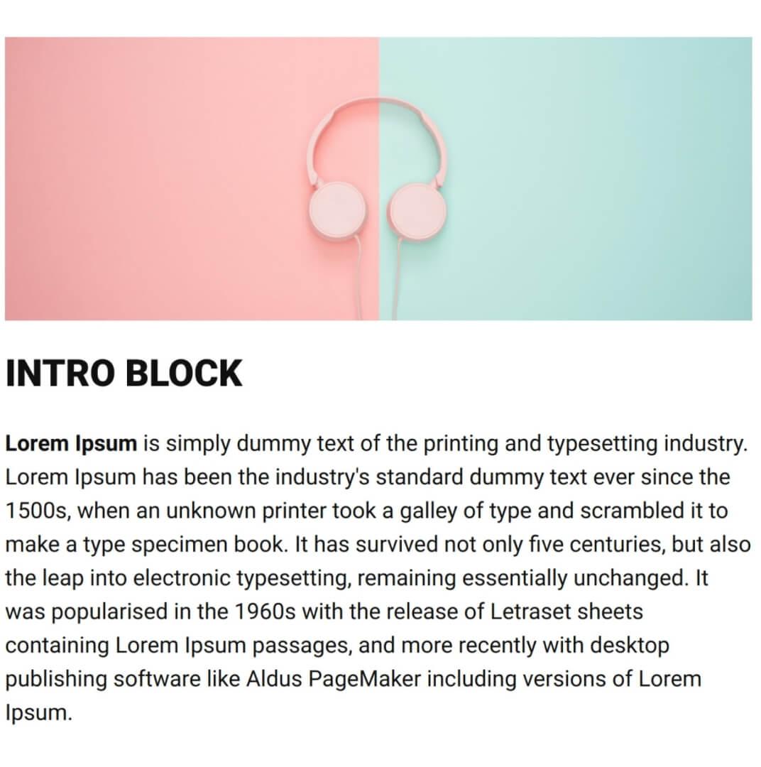
Block 1 - Text and image
The first block only includes an image and a text field. Remember that the image tag must have the width and height attributes and the path must be absolute. Set styles for text and add indents. Example:
Block 2 - Product list
The second block would be a commerce product list, such as those displayed via views (table display). In our example, each table row has 2 cells with one product in each.
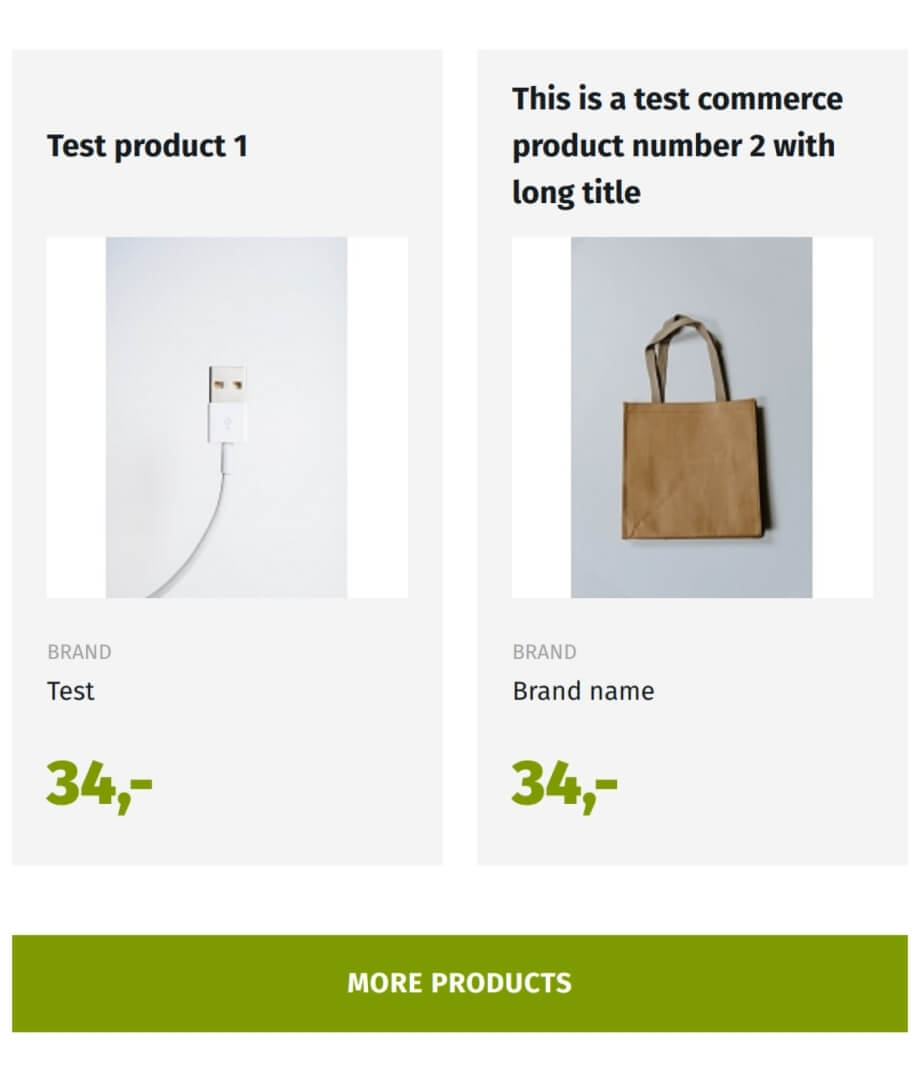
The "More products" link should be wrapped in a table ".bottom-wrapper" as shown below. Apply the styles to the cell because Outlook will delete almost all <a> tag styles.
{% block content %}
 {{ content }}
 <table class="bottom-wrapper">
   <tr>
     <td>
       <a href="{{ host }}/path-to-page">{{ 'More products'|t }}</a>
     </td>
   </tr>
 </table>
{% endblock %}
There is an alternative approach as well. Write regular button styles for the link first, then add a separate entry with styles (out of the main <style> tag) inside the template for Outlook only:
{# Outlook styles #}
<!--[if mso]>
  <style> </style>
<![endif]-->
How to make a link tag look like a button (for Outlook), using a VML object, is well described in the article “Implementing emails in 2021: Rounded buttons with shadow that work in Outlook.”
How to test your newsletter
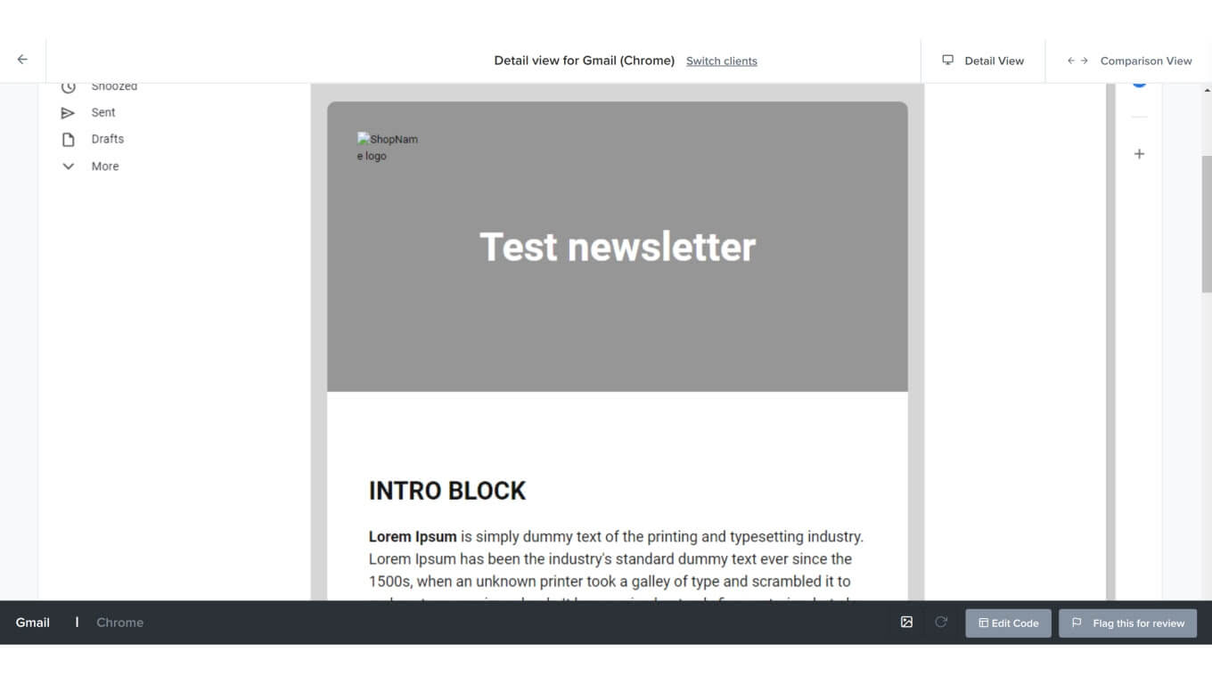
Now, you can test the result. I employ Litmus for testing since it allows sending some content to a specific email address and getting a preview of the letter in different email clients. Moreover, you can see the HTML source code of the letter, which is very useful because some email clients change the original code, adding wrappers, classes, and styles that may cause some display issues.
To send an email from a local machine, configure sending via SMTP or other services. Alternately, use a module like Maillog / Mail Developer | Drupal.org, which provides an email code that can be manually added to Litmus. Litmus is a paid service, but the price is fully justified by its capabilities.
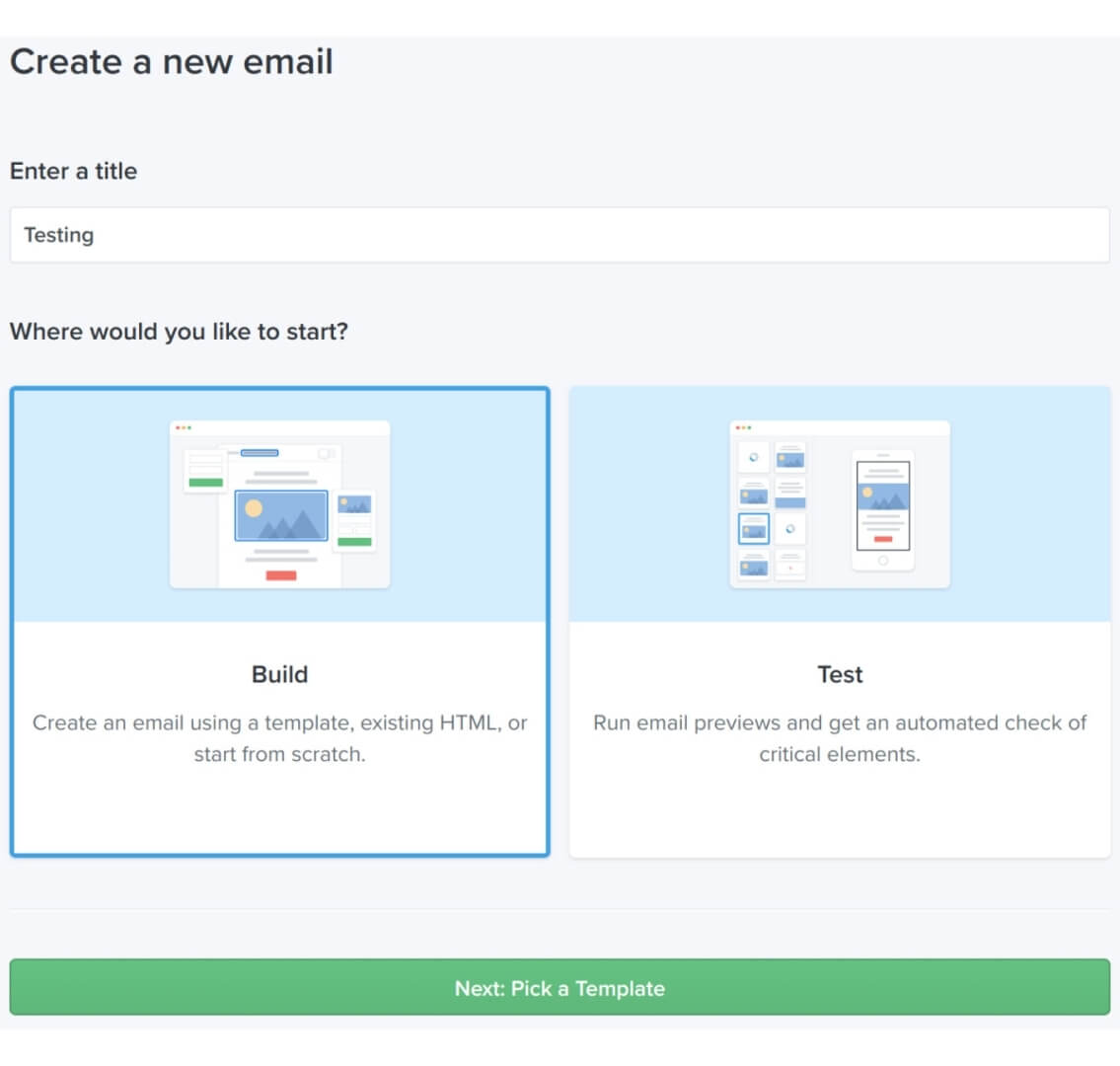
Get started with logging in and starting a new project:

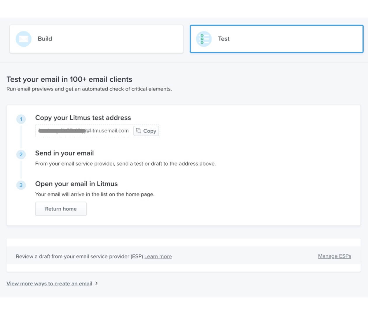
Choose one of two methods for the testing: adding HTML manually or sending an email to a special email address. I prefer option number two.
Litmus will provide an email address which you can use to send your letter.
When Litmus receives a letter, a notification is shown. Start the process and select email clients to see the result.

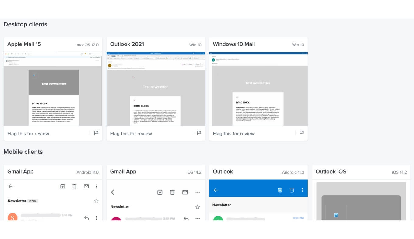
In emails sent from a local machine, all images contain a path to the local site, so email clients don’t have access to them. As a result, the images are not displayed. Knowing this detail, you should reconfigure the paths so that they are available on the Internet.
If there is something wrong with the letter, it’s possible to look at its code and find the cause of the problem. Open one of the previews, then use the “Edit code” button:
The "Email previews" (screenshot below) lists clients. If you select one of them, a preview will be displayed with the real code of the letter after the client gets adapted to it.
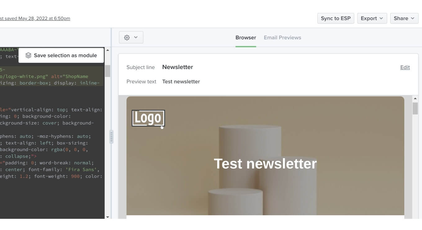
Let's take a look at the Outlook code (click on button 1 circled on the screenshot).

Now let’s have a look at some display issues. In our case, links are displayed with underlined text.

Unfortunately, it's not about ignoring the "text-decoration: none". To fix this, add Outlook-specific styles:
<!--[if mso]>
<style>
  a:link,
  span.MsoHyperlink {
    color: rgb(255,255,255,0) !important;
  }
</style>
<![endif]-->
This is how it looks after our refinements:
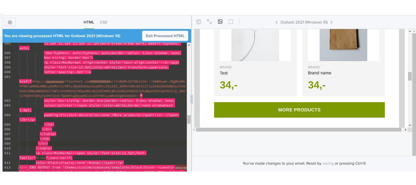
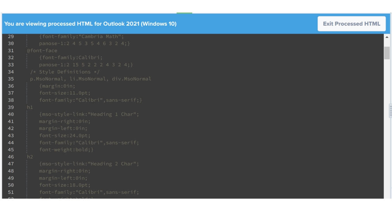
These "a: link, span.MsoHyperlink" styles are found in the code, so it's easy to detect what went wrong. Also, the browser inspector can be used to see the code of the letter on the page. At the very beginning of the code, all the styles that Outlook adds are shown; you can use this to override any of them, as needed.
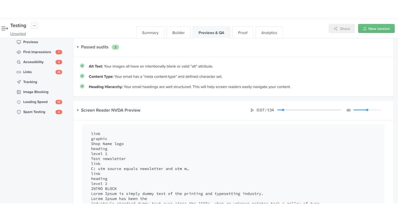
After testing the visual part, you can check the letter for accessibility. The screen reader can read and display the text. To make the content as clear as possible, add a description to all images, avoid adding links without text, etc.
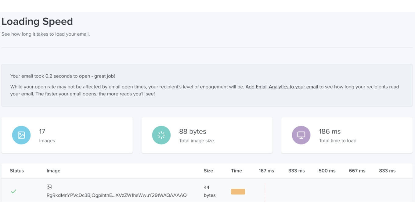
Finally, it is possible to determine the download speed of the content. Few people consider this in the context of email, but it consumes internet traffic, which can be limited and expensive, and the connection speeds are sometimes poor. So, the lighter the letter, the faster the content will be displayed.
LB blocks can be translated, so it is possible to send a specific language version to users based on the language settings in their accounts.
Takeaway
The use of Drupal LB to create content for mailing gives content managers a great opportunity to create newsletters quickly and easily. However, it also depends on the number of blocks and variety of content you need to implement.
Knowing work specifics of different email clients saves a lot of time for developers. Such knowledge comes in handy when you need to make timely changes to the design if its look is too heavy for building the newsletter structure.
For example, there are elements in the design that are visually located over other elements, images, etc., and it’s better to avoid such overly complex things. Of course, a developer can try to make the image background and put the overlapping elements inside, but it may not work if you use Outlook.
Pay attention to Litmus — a powerful service to debug emails during and after development. It allows detecting all the issues swiftly, and if you have the Litmus knowledge base I shared with you in this article, you will deal with difficulties easily.
As you can see, Drupal is an extremely flexible and powerful CMS, especially with the competence of our Drupal developers. So don’t hesitate to contact us and gain the support of the LS team. We can smooth out the Drupal development process and deal with any pitfalls that may arise during your project. Take a look at how we’ve already helped multiple clients!

