Struggling with low conversion rates on your website? The problem might be in your search bar functionality. No wonder, as a smooth on-site search increases website conversions by 1.8 times. A well-designed search function increases the user satisfaction, turning their navigation on your website into a seamless journey.
Interested in how to make your search UX more user-friendly? Below, we collected the most common problems users encounter and shared the best practices on how to enhance your search functionality.
Common problems in search UX
Search function is one of the cornerstones of discoverability in UX, and yet it is often left overlooked. Below, we've summarized common search UX mistakes. If your search function has all of the following, then it probably needs a complete redesign.
Unclear search interface
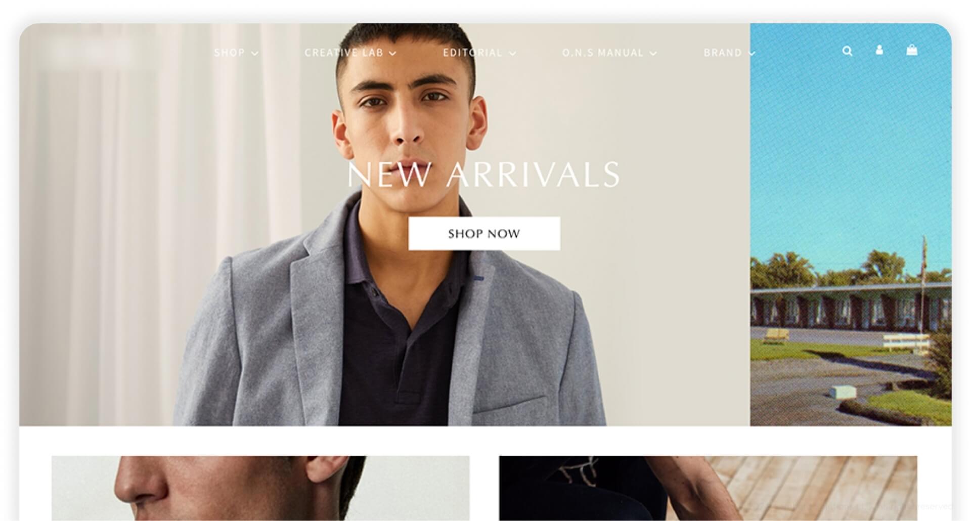
A well-designed search interface is one of the key ways users interact with your content or products. Yet, some designers neglect crucial design elements, putting usability of whole search functionality at risk. The inadequate contrast ratio, overreliance on icons or text labels instead of clear search field or odd search bar placement are factors sabotaging the user experience. As a result, a poorly designed search interface makes it difficult for users to connect with what you offer.
Poor search results relevance
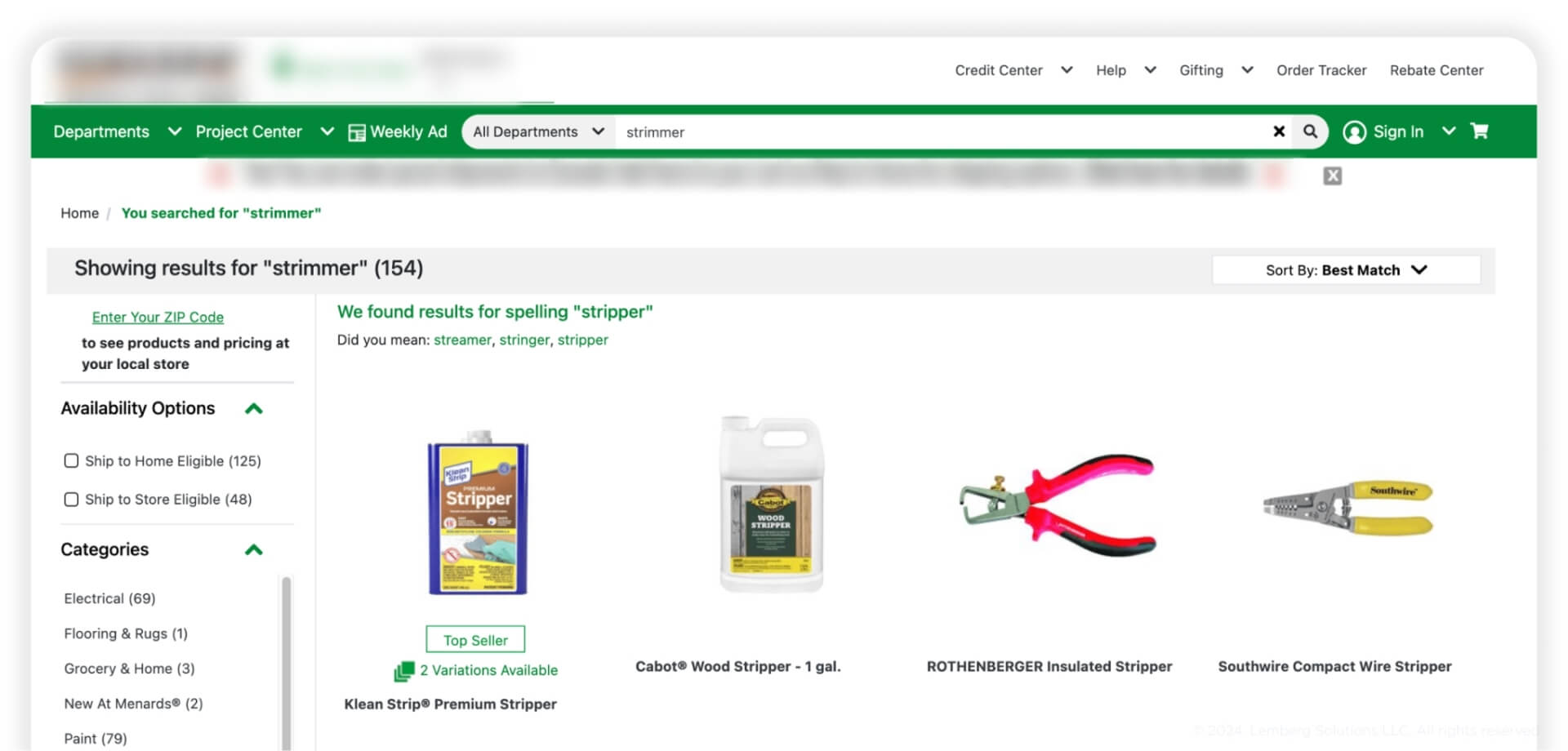
The search function’s main task is to provide users with relevant results. Users can make minor mistakes when typing their request, still, they expect the search engine to understand them. When struck with irrelevant results, users are most likely to abandon your website in dissatisfaction. Failure to understand a user's request and provide a precise answer creates a risk of losing potential clients or, even worse, ruining your business's image.
Lack of filtering options
If your website has a huge catalog with thousands of products, and the search function has no filtering capabilities, this is a direct path to complete failure. All users want to find the item that matches their needs quickly and lack of filtering options leaves the user disappointed. Instead of narrowing down the list of all possible products, users should scroll through tones of irrelevant results on their own. The lack of filtering options completely disregards the main goals of search functionality – reducing the search time and providing personalized user experience.

Key principles for better search UX
A well-designed search interface determines the overall success of your website. Before building the search UX, consider these three key pillars that your search engine should be based on:
Relevance
The search functionality is created to connect users with the exact product, service, or content they need. Users expect search engines to understand their request, no matter how complex it is. The relevance of search results directly impacts user satisfaction and may turn the user into a loyal customer.
Usability
The main idea of usability is to make the search bar simple to use in any situation. The more straightforward the interface, the faster the user will find the desired product. The search bar should help users, not confuse them. Keeping this idea in mind, prioritize simple, commonly known interface patterns and intuitive functionality to streamline the search process.
Rapid system’s feedback
Apart from providing relevant search results and user-friendly interface, the search engine should be responsive on each step of the user’s search. The system should inform users about the results of their actions to keep them updated on the current state of their request. If the search system doesn’t provide such a feedback, users may think the website is non-responsive and leave it early in confusion.
Best practices on how to build on-site search
The search functionality on the website can either make or break a user's experience. Check out the following practices to ensure best search UX design that caters to users’ needs and drives your conversion rates.
Simple design and prominent placement
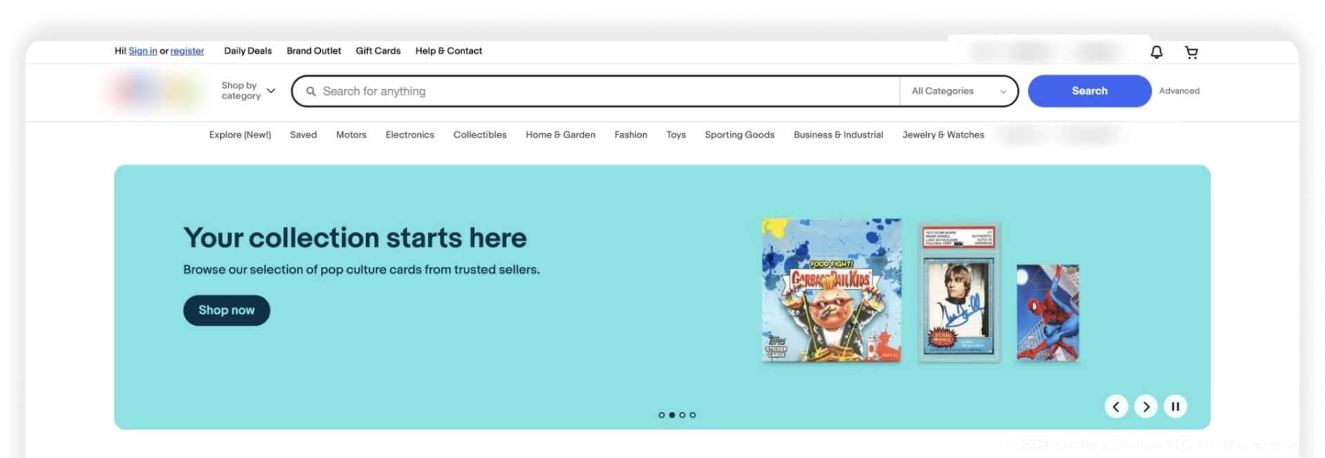
A good on-site search starts with a clear UX design and prominent search bar placement. The search bar should be visible and accessible from any page. If you feel your users rely a lot on search, put it into top navigation, centered or right-aligned, and make it distinct. It should be easy to interact with, and long enough to allow users to enter lengthy requests without cutting off text.
Don't forget to add a magnifying glass sign as a symbolic search marker so users can easily find the search bar and enter their query. To make the search even more efficient for users, you can add placeholder text with suggestions or hints to guide the user on what they can search. Ensure that these placeholders can be hidden after the user starts typing to avoid overlapping texts that confuse users.
Search suggestions and instant feedback
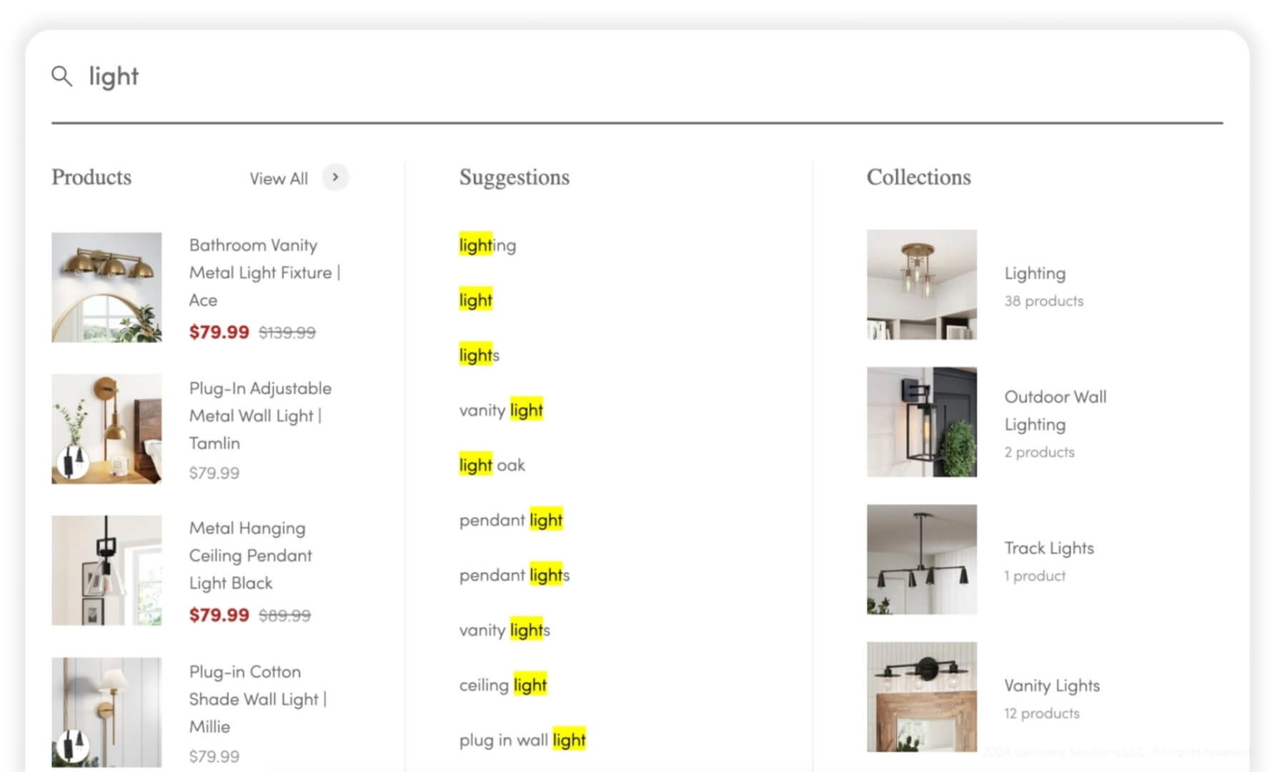
The autocomplete search suggestions feature makes the user experience more interactive and straightforward. Now, users do not need to complete their long requests; the search can make real-time suggestions of relevant items with similar names. For better comprehension, ensure that the results are highlighted when the keyword matches the text entered. You can also show the user’s search history in case they want to return to their previous requests. This solution saves users’ time and makes their search journey more efficient.
Faceted search and filters
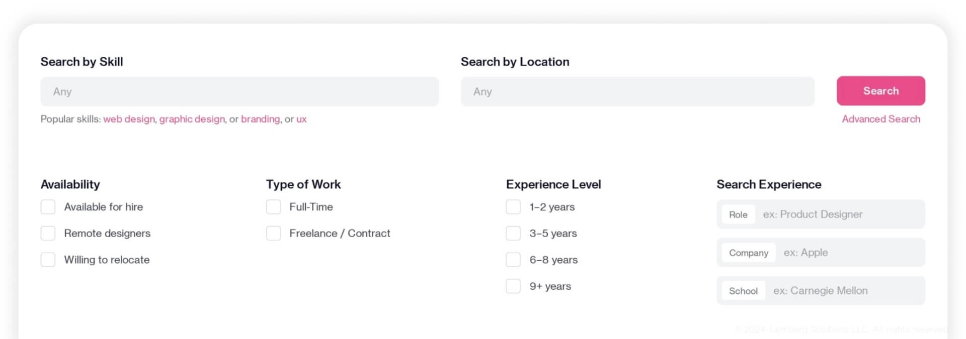
The filters and facets can help users find something specific in the span of seconds and with little effort. Make sure filters are logically organized and easy to toggle. Provide users with intuitive filters depending on the products you offer. Don’t forget that when changing the filters, the system must respond quickly to reset the search and display new results. This way, users will be more satisfied with relevant and more personalized results.
Zero search results handling
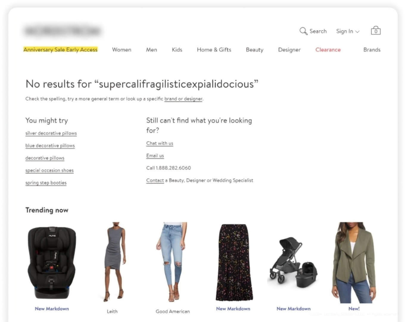
There are several reasons why zero search results may appear. The query may contain a significant amount of errors, be overly descriptive, or you simply don't have such a product in your catalog. Regardless of the reason, your site should handle any type of requests properly, even if you don't have a relevant answer. The most common approach is to display the “No results” message with additional description of reasons why it happened. In this case, provide the user with a list of semantically related items to the request. Also, you can leave the links for customer support chat so users can discuss the situation with the manager. This way, you will provide the necessary support to the user and also get valuable feedback to improve your product.
Responsiveness
Many website owners ignore the fact that the search functionality should be easy to use across different display resolutions. From mobile phones and tablets to huge desktops, your on-site search functionality must be properly adjusted to different screens to ensure a seamless user experience regardless of platform. For mobile users, ensure the tap zones are large enough and avoid placing elements too close to prevent accidental taps.
Accessible design
Another key thing when working on a search bar is to ensure it is accessible for people with different impairments, be it hearing, visual, motor, or cognitive. Here are the main factors you need to focus on to make your search accessible:
- The contrast ratio between the text color and background color must be sufficient (at least AA level) for people with visual impairments to comprehend.
- Use plain language to make information clear and easy to understand for everyone. Simple words, short sentences, clear structures, and action verbs to guide navigation are all relevant recommendations to make the search highly accessible.
- Provide an alternative text for all icons so that users with screen readers can understand elements correctly.
- Your search field and search results must be easy to navigate using a keyboard. Ensure that when a user is navigating the search, the element they are currently focused on is clearly highlighted or visually indicated.
- If possible, allow your users to voice their search queries, relying on voice recognition technology to process the requests.
Final Thoughts
Search functionality may seem like a minor feature, but its impact on user engagement and business success cannot be overstated. By investing in on-site search design and development, you can elevate your digital brand and enhance user satisfaction.
Follow our practices for crafting a top-notch search functionality to drive your KPIs and provide users with unparalleled search experience.
Need a hand with developing search UX from scratch or revamping the existing one? Contact us today to enhance the search experience for your users!


